The same is true of some other colours I love. There's a blue that I call cornflower blue but (according to my computer monitor) is closer to Persian blue. I first bought this as a T-shirt, then another T-shirt that's orange with stripes of this blue, then I bought matching canvas ballet flats, and after a very drawn-out search for accessories in the same colour, I was very excited to find an Indian silk scarf in this blue in a $1 basket at Camberwell Market.
Another colour I'm obsessed with is a light orange-red (scarlet?). I first became obsessed with this colour in lipstick and nail polish, but I now own several T-shirts in various hues of it, plus several scarves. I own a lot of red clothing, but it varies between a 'true' medium red (stop sign red), a faded medium red, a blueish red and a rich ruby red.
Being from Melbourne I own a lot of black clothes – I now own five pairs of black pants, four black skirts, two black cardigans, four black jackets, three black dresses, and so many black tops that I have to pick them out by the feel of the fabric when I want to wear one in particular. Sometimes I get into hopeless rages because I can't find the particular black top I want, and I have to empty them all onto my bed to sort them out.
When I feel especially despondent about the way I look, I will wear black because it is easy to look 'put together' in an all-black outfit. But in shops, I prefer looking at colourful garments. Today I was in French Connection and I was drawn to a bold orange winter jacket with square buttons (they want $260 for it, tell 'em they're dreaming!) and some knitwear in oranges and apple-greens… purely because these things stood out from the boring blacks, greys and navies in the rest of the store.
So this winter I have decided to dress for colour rather than for silhouette or texture. Being a fat chick, I find dressing for silhouette quite dispiriting because I simply don't look good in many sculptural clothes: for instance, nipped-in waists with voluminous skirts, tops tucked into high-waisted pencil skirts, or form-fitted dresses with voluminous sleeves.
Dressing for texture I see as something ageing women do to show they're still 'in fashion' while wanting to de-emphasise their bodies. So they'll layer different textures with stuff like scrunched-up satin, embroidery, fringing and beading, knits of various gauges, and varying amounts of sheerness and opacity. Maybe I'm wrong about this being something that older women do, but I think it can be quite ageing on young people.
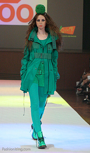
Fool, 2009 L'Oreal Melbourne Fashion Festival. Image: Fashionising.com
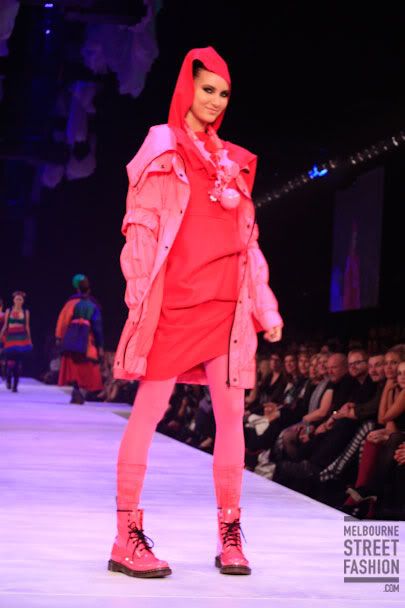
Fool, 2009 L'Oreal Melbourne Fashion Festival. Image: Melbourne Street Fashion
I was really inspired by Fool's collection at this year's Melbourne Fashion Festival. They brought out some models in very bright contrasting colours, with playfully oversized knit accessories. But my favourite outfits were the ones that layered different shades of the one colour. I think it looks really striking.
I was also really inspired by the outfits that Isla Fisher wears in Confessions Of A Shopaholic. I love the bright yellows, pinks and oranges she wears, and I especially love her colourful leather gloves.


So my strategy this year is to wear relatively soft and shapeless garments, but to layer different shades, or wear bold contrasting (or even clashing) colours. I even want to wear clashing prints, such as polka-dots with tartan or different florals together. I would try to make sure that there was a common colour in all the prints to hold the look together.
The risk you run with colour layering is that you look like a batty old lady. Here I always think of Linda Jaivin when she appeared on that old ABC arts panel show, Critical Mass, always with her red glasses and red accessories. I find it embarrassing when people have a 'signature colour' and that's all they ever wear.
The opposite risk is that you look matchy-matchy, which is my word for the sad result when you can tell someone has attempted to match the colours in different parts of their outfit but it looks very timid and fussy. For instance, the other day I saw a woman wearing a pink top, grey pants and pink shoes – but they were the wrong shade of pink. Her top was more like a salmon colour, whereas the shoes were fuschia. You could almost imagine her thought process while getting dressed that morning: "Yeah, I'll wear my pink shoes".
I used to mistake matchy-matchiness for elegance, but (largely after reading The Sartorialist) now I feel it's much more elegant to echo the colours of an outfit rather than attempt to match them precisely. You don't want to look as though you're in uniform: you want several small colour details to leap out at the eye.
Today I am wearing my fuschia Hammer pants with my cornflower blue T-shirt, scarf and shoes. I am wearing a black cardigan over the top but for once I don't feel it's too 'Melbourne' of me, as in this new way of thinking, the black is the highlight colour rather than the base colour.