Tuesday, July 09, 2013

Expedition to Savers

In Out of Shape I write about an expedition I made last year to Savers. It actually turned out to be a good-value expedition because I bought a bright yellow self-stripe skirt that I've worn a lot in both winter and summer, and some jewellery I've likewise got lots of wear from.


Two pairs of earrings and a brooch


The skirt is a much more lurid acid-yellow than it appears here. I photographed the waistband because I was so proud of altering it from a dropped waist to a high waist.


Me modelling the skirt (weirdly tucked up at one side; I dunno why) and my book outside Luna Park last week, during Home City Book Tour.

But on the day I was really annoyed because I wanted to emerge with a 'haul', yet none of my pet items were there. The items above were literally all I bought.

Well, my imminent appearance on the Today show (Tomorrow! 8:20am! Channel 9!) gave me the excuse I needed to make another pilgrimage to Savers. I was really annoyed at myself because I started out too late, meaning I had less than an hour in the store before it closed, and I didn't give myself enough time to go through all the departments properly.

However! Savers Mill Park had some GREAT stuff this time around! I was super excited to see this Diane Freis dress (as collected by Kate Millett of Bombshell Vintage), but disappointed that it was too small in the bust and kind of squished my boobs flat.


Sorry about my bad, blurry photography. I have terribly shaky hands. The sleeves were very full and blousy, and the skirt lovely and wafty, and it had a contrasting band of fabric defining the waist. It might still be there!


I was also taken with this muumuu, an authentic made-in-Hawaii souvenir. However, as I detail in the book, muumuus have acquired cultural connotations of slovenliness and decrepitude, and I just couldn't bring myself to try it on. I already fret that my fingers are too fat to use the phone.


Now this is fascinating. I've read about half-sizes but I've never actually seen one before. Basically, these were like a mixture of petites and plus-sizes: they assumed a shorter height, lower bust and curvier figure. If a half-size is 20 or above, it's probably a plus-size; otherwise it might just be for a shorter person.

Apparently, half-sizes date a garment to between the 1940s and the 1970s. This was a very '70s-looking party frock with long sheer chiffon sleeves, a full accordion-pleated chiffon skirt and an elastic waist. I wish I could find out more about  the Janelle label; it's not listed at the Vintage Fashion Guild and in my searching I can only find 'Janelle' used as a name.

There were heaps of other great dresses on the rack, in the bright block jewel colours I like. But they were either too tight, or too drapey in a way that would have people solicitously offering me their seat on public transport, if you know what I am saying. There was one violet dress (I am really into violet-purple at the moment) that nipped me in Hendricksically at the waist, but I know from bitter experience that it would get unwearably uncomfortable after about half an hour.


Before I knew it, the store was closing and I still had a few dresses I had yet to try on. So I recklessly bought them anyway. The above purple print button-through frock is one of them. Because it has a sash tie at the back, I thought I'd be able to cinch it in if it was too big. But when I tried it on at home, I realised it's clearly made for someone bigger than me. The sleeves are too baggy for my arms, and my boobs don't fill out the bust.

I figured I'd resell the purple dress, since plus-size vintage is so hard to come by. It has no labels and I think it might be home-made, although the neckline is interfaced and the seams are overlocked. It's a light, silky fabric that feels like rayon or viscose. Flat measurements: waist 61cm; bust 64cm (from armpit to armpit); centre back length 102cm; sleeve length 26.5cm (from shoulder seam).

The bodice is in three panels, gathered slightly at the waist so there's room in the bust, and the sleeves are slightly gathered at the shoulder. There are small shoulder pads to create a structured 1940s look. The skirt is perhaps a half-circle shape in seven panels and has two pintucks: one on each side of the front.


The back of the dress, showing the sash which can be used to tighten the fit.


Detail of the fabric and the buttons. You can also see the waist seam just below the third button.

If you're interested in buying it or know someone who might be, please leave me a comment or send me an email.


I also bought these shoes. I have discarded my previous philosophy of fewer and better shoes because honestly, I wear through them all just the same. Either I grind down the inner sole from inside or I grind down the outer sole until it cracks or splits. I try to prolong them using insoles, but I grind those down too.

Black mary-jane flats are one of my 'collecting focuses'. I always look for them in op-shops when my last pair is nearly gone. They always look slightly different – the toe squarer or rounder, the upper more ornate, the heel moulded in slightly different ways. These patent ones replace a pair with flowers stitched to them (which I am wearing in the Luna Park pic above), which replaced a pair with decorative cutouts and contrast stitching, which in turn replaced my Grosby leather ballet flats that split in the sole.

And peeping into the frame you can see the other dress I bought without trying it on, which I'm actually pretty chuffed with. In daylight it looks chocolate brown but I think it was originally black but has faded with age. It's '70s does '40s, with a wrap top, long sleeves puffed at the shoulder with little shoulder pads, and an accordion-pleated skirt from an elastic waist.


This is how I styled it on Sunday. I was trying to look a bit retro because I was talking about the Wizard of Oz costumes at ACMI. I assure you my victory rolls looked better IRL than they do in this pic.

Friday, July 05, 2013

Napoleon's hand-in-waistcoat pose


I bet you have wondered why Napoleon Bonaparte is so often depicted with his hand stuck in his waistcoat. Again, we must return to the shit-scared aristocracy after the French Revolution. This was a time when it was very bad taste to dress in a foppish way.

In England, the aristocracy sought to redefine itself as strong and patriotic – "don't guillotine me, bro!" – through associating itself with such social institutions as the public school, arts patronage, organised fox-hunting and the reform of the armed forces. Each of these developed their own specific costumes.

Beau Brummell's rise began as an Eton schoolboy; his first sartorial innovation was, apparently, to add a gold buckle to the traditional Eton white cravat. He then took his style to Oxford, and finally became an officer in the Prince Regent's own regiment, the Tenth Royal Hussars.

We should perhaps not judge Pride and Prejudice's silly Kitty and Lydia Bennet too harshly for lusting after soldiers, because the Napoleonic-era military were the rock stars of the day, and their uniform was an exercise in what today we might call 'swag'. Beautifully tailored, brightly coloured and decorated with sashes, gold buttons, and ornate piping, fringing and braid, it was designed to look dashing and impressive, no matter how inadequate the body of the wearer.

An 1830 English instructional pamphlet offers specific ways in which military uniforms could camouflage an unimpressive physique: "an insignificant head" hidden under a helmet; a coat "padded well in every direction"; and the sheathing of "bandy legs, or knock knees" in stiff, thigh-high leather boots with two-inch heels!

Perhaps the transformation wrought by this finery is partly responsible for that genre of heroic military portraits depicting soldiers with their hands tucked in their waistcoats. They look almost vulnerable, as if wanting to reassure themselves their bodies are still there!

The 'hand-in-waistcoat' pose is most associated with Napoleon, but by his ascendance it was already an English portraiture cliché – one artist was accused of using it to hide his inability to paint hands! The gesture of touching the body through a suit is associated with "manly boldness tempered with modesty", as François Nivelon puts it in his 1738 etiquette guide, A Book Of Genteel Behaviour.

It appears so often that this loopy conspiracy-theory website (and other similar sites) identifies it as a secret Freemason signal: the "sign of the Master of the Second Veil". Apparently, Napoleon helped revive the Knights Templar, and there are pictures of other known Freemasons posing like this, clearly signifying their membership to anyone in the know!

I am going to be generous and allow that this coded meaning could be legit. After all, Exodus 4:6 describes God instructing Moses to stick his hand "into thy bosom" (in other translations, into his robe or his cloak), bringing it out all white and leprous, then sticking it back in again and retrieving it whole and unharmed. It's a miraculous sign for Moses to wow the Israelites with in case they are skeptical that he is truly God's chief dude. So the pose could signify faith in God's power.

This is like something from The Sign and the Seal, the ridiculous conspiracy-theory book I have been struggling through. I was hoping it would be a ripping Indiana Jones-style yarn, but I kind of gave up halfway when the author mentioned Atlantis.

I think it's more convincing to trace the pose, as Arline Miller has done, to the spirit of classicism that prevailed in 18th- and early 19th-century Europe. The pose is about re-infusing the male body with classicist dignity and honesty after an era of baroque dissipation.

Many Georgian and Regency artists copied the pose from ancient Greek and Roman statues; the 4th century BC actor and orator Aeschines of Macedon had argued it was ill-mannered to speak with one's arm outside the toga.


Basically, Aeschines' beef was that most politicians of his generation didn't behave with dignity: as Paul Zanker writes in The Mask of Socrates, "they no longer observed the traditional rules of conduct but gesticulated wildly for dramatic effect, just as the demagogue Kleon had been accused of doing in the late fifth century."

For those not down with ancient Athenian political personalities, Kleon was the hawkish politician who vigorously prosecuted the Peloponnesian War after the death of the cultured, cautious Pericles. Kleon was anti-intellectual, anti-elitist, and boy did he hate the Spartans. He had a forceful, hectoring oratorial style; both the dramatist Aristophanes and the historian Thucydides wrote unflatteringly about him. Clearly Kleon was still disliked a century later, if Aeschines still used him as an example of how not to speak.

Here's a Roman copy of a Greek statue of dramatist Sophocles, c330BC. It's strikingly similar to the statue of Aeschines:


Do NOT be telling me that these guys were Freemasons. (Maybe Freemasonry originated in Atlantis, LOL.) Doesn't it make more sense to imagine that later statesmen adopted the pose to lend them classical gravitas?

Thursday, July 04, 2013

Home City Book Tour

As advertised, a few days ago I went on a book tour without leaving my home city. I was chauffeured by Affirm Press's sales and marketing manager Keiran Rogers in the company Prius (Affirm Press is a socially and environmentally responsible publisher, so that's how they roll).

It was a wonderful winter's day to be out and about – crisp and sunny. At first I was embarrassed to admit to being the author of my book ("Uh, do you have Out of Shape by Mel Campbell?") but Keiran was very matter-of-fact about it, and the booksellers totally knew the drill.

They were a great bunch of people: friendly, knowledgeable, and genuinely passionate about reading and writing. I really encourage you to buy books in bricks-and-mortar stores if you can. The ones I visited were all lovely places: airy and well laid out.

I tweeted our progress around town, photographing my book in various shops, and I've made the tour into an interactive map, so you can follow where we went. Just click on the placemarks to see the photos and text, and if you find the pop-up boxes extend off the map, click and drag anywhere on the map to reposition it and pull the info into view.


View Home City Book Tour in a larger map

In other news, I wrote an op-ed about Cosmopolitan magazine's recent, ridiculous "Size Hero" body image campaign for Junkee, which was syndicated to The Guardian. Here's a taste; click through to read the rest.
It is comically naive to think we can counteract a lifetime’s worth of immersive, pervasive cultural messages about body size and shape just by bunging a few scantily clad celebs and plus-size models in magazines. But weird magical thinking aside, we should reject all these campaigns for the same reason: they teach us that our bodies are other people’s property, to be gazed at and judged. You shouldn’t need Cosmo’s permission — or anyone else’s — to feel good about yourself.

And, excitingly, I've been invited onto Channel Nine's breakfast TV show, Today, this coming Wednesday (10 July). I'll be on air at 8:20am, talking about 'change room anxiety' and other issues. So I'll be making a flying visit to Sydney next week and hopefully will be able to pop into some bookstores there to chat to booksellers and sign copies of the book.

Sunday, June 30, 2013

Theorising how fashion changes over time

When I was writing the book, I did a lot of scholarly research about theories of fashion. Pretty much all that remains of that in the finished volume is my experience of sitting in the Baillieu Library at the University of Melbourne. I did some intensive study there at the start of last year, taking notes from academic books.

I love the Baillieu. Working in there is like stepping back into the Mad Men Time.


A librarian checks books in the newly opened Baillieu Library, 1959.


Students in the second floor study area, 1959. Check the Mitzi chairs.


The Baillieu Library today. Mitzi chairs!


MITZI CHAIRS, Y'ALL!

The reason I was researching theories of fashion history was that I wanted to explain the mechanisms that drive our ideas of fit. We have a certain understanding – either intuitive, or explained to us by the fashion media – of how tightly or loosely our clothing should fit, and in which places on the body, in order for us to feel the most attractive and morally appropriate in our clothes. Those ideas change over time, and when we look at them in hindsight they become the 'fashion' of certain historical periods.


The cast of Beverly Hills, 90210 model early 1990s-style jeans.

Fashionable jeans during the 1980s were commonly high-waisted, tight across the torso and narrow at the ankle. They became baggier in the 1990s, and by the early 2000s they were flared at the ankle and very low-slung on the hips. Even though not everyone dressed like this, the fashion was widespread enough, and expressed often enough in pop culture, that we can guess when a photo was taken by the style of someone's jeans.


Britney Spears models early 2000s-style jeans. Tag dag!

When a style of jeans isn't currently in fashion, we call it 'frumpy', 'trashy' or 'dorky' because it becomes negatively associated with nerds who don't care what's cool, or older people clinging pathetically to the looks of their salad days. And once fashion has moved on even further, certain fits acquire a retro cachet. Tight, high-waisted jeans are cool again now – and hip twentysomethings even celebrate baggy, high-waisted, '90s-style jeans ironically, as 'mom jeans'.

Of course, not everyone wears jeans. They've also meant different things at different times to different people: utilitarian workwear; bohemian rebellion; a youthful uniform; a sexual invitation; even a litmus test of weight gained or lost.

We might grasp this multiplicity of meaning intuitively because jeans are familiar to us… but the further back we travel in time, and the more unfamiliar clothes become, the easier it is to lose sight of the ways in which fit is culturally influenced, and the more tempting it is to make broad generalisations about how and why it changes.

'Costume history', as an academic discipline, arose from art history and shares its analytic techniques. Fashion reference books in this old-school genre promise a broad survey of aesthetic change over time, explaining which sartorial motifs appeared when, and how they were devised, combined and repeated. In seeking to make the past concrete, these books can seem oddly fixed and timeless themselves. For instance, François Boucher's epic 20,000 Years of Fashion was first published in 1966, while Ruth Turner Wilcox's The Mode In Costume dates from 1942. Both have been consulted by generations of students, designers and aficionados.

But like fashion itself, this aesthetic approach to fashion history can very quickly seem dated. In my own collection is a 1974 reference book for children, Clothes in History by Angela Schofield, which I bought in a sale at my local library. In a piece of retrospective comedy, it begins with an illustration of cavemen and ends with a photograph of a bearded 1970s hippie in a shaggy shearling coat who looks, to my eyes, hilariously similar to the cavemen.

Thinking of clothes chronologically does help reconcile fashion's emphasis on the 'now' with its constant citation of past styles – but we rarely stop to ponder how weird and arbitrary it is to link fashions either with broad eras or specific decades. For instance, why do we speak so sweepingly of 'the Victorian era' when it lasted from 1837 to 1901, during which time a vast variety of distinctive clothing styles came in and out of fashion? Why must the 'Edwardian era' or 'Belle Époque' make way for the 'Twenties' through to the 'Nineties'?

In today's atomised understanding of fashion motifs, 'military' and 'nautical' conquer 'tribal' and 'boho'. It seems that the more recent the clothes, the less hindsight we have on them in order to slot them into neat epochal categories. But in any case, understanding how styles evolve over time doesn't tell us what it meant to live through history, striving to be fashionable.

Another thing I noticed during my research is the application of sociological theories to fashion changes. I'd argue that these ideas have acquired their current authority through sheer force of repetition. They're another way that we try to master the past by overlaying a grand narrative on it – this time of class, rather than of aesthetics.

For instance, it seems persuasive that rich people might wear fancy, restrictive clothes to advertise  their independence from manual labour – but that's because American economist Thorstein Veblen's theory of 'conspicuous consumption' and 'conspicuous leisure' has been parroted since 1899, snowballing in plausibility as generations of fashion historians and journalists based their work on it.

The idea that rich, powerful people innovate fashions for the plebs seems so natural now that in the 2006 movie The Devil Wears Prada, superbitch fashion editor Miranda Priestly (Meryl Streep) sounds unassailably authoritative as she acidly schools her new assistant Andy (Anne Hathaway) in the market diffusion of the colour cerulean:


This 'trickle down' theory has been around since 1904, when German sociologist Georg Simmel argued that once a style becomes accessible to the lower classes, the elites abandon it and create a new fashion to distinguish themselves further. And the idea that fashion industry gatekeepers – designers and magazine editors – are now the elites dates from 1969, when Herbert Blumer wrote that someone's ability to interpret the zeitgeist – the 'spirit of the times' – and sense where modernity was heading elevated that person to elite status.

Of course, some trends are spearheaded by non-elites: marginalised ethnic, working-class and youth cultures influencing the sartorial sensibilities of dominant, bourgeois white culture. Back in 1970 marketing academic George A Field theorised this phenomenon as 'status float'. And by the time anthropologist Ted Polhemus dubbed it the 'bubble up' (as opposed to 'trickle down') effect in 1994, subcultural style had become so entrenched on couture runways that it had already been the subject of a retrospective at London's Victoria and Albert Museum!

Whether it trickles down or bubbles up, if we attribute every change in fashion to an ineffable zeitgeist it becomes, in the words of fashion historian Joanne Entwistle, "almost a supernatural hypothesis". We forget that people's clothing choices aren't shaped monolithically by social structures, but by their subjective experiences of history, society and industry.

For instance, World War I may have broadly provoked the radical changes in women's fashion between the 1910s and the 1920s, but the war didn't directly make hemlines rise, nor inspire bobbed haircuts. There was no mass consensus among newly emancipated women to "throw away their corsets", as we're so often told.

Those fashions developed gradually, chaotically, from myriad changes that spread through different aspects of Western cultural life, like the intersecting ripples from several stones thrown into a pond at once. They only seem sudden and decisive from our vantage point, a century on.

Culture, much more than aesthetics or socioeconomics, captures ephemeral social attitudes and contextualises the past, like a lens focusing our appreciation. Just as I came to appreciate the Mitzi chair after Mad Men turned me on to midcentury modern design, our associations of historical dress with artworks, novels, movies, songs and more shape our understanding of the past.

That's why my analysis of fashion history in the book is largely refracted through culture: because our subjective, emotional consumption of these texts re-injects historical clothes with the subjective agency and affect that aesthetic and sociological theories strip away.

Wednesday, June 26, 2013

Talkings, readings, signings


The Out of Shape publicity train is still chugging away on its journey to MOAR SAELZ. Here are some upcoming events I'm involved in:

Next Wednesday, 3 July, I'll be roaming around the bookstores of Melbourne with Affirm Press's sales and marketing manager, signing copies of my book. Starting in the city at 9:30am, here are the stores we hope to visit:

Hill of Content Bookshop, 86 Bourke St Melbourne
Embiggen Books, 197-203 Lt Lonsdale St Melbourne
Reader’s Feast, 162 Collins St Melbourne
Dymocks, 234 Collins St Melbourne
Thesaurus Books, 29 Church St Brighton
Avenue Bookstore, 127 Dundas Place Albert Park
Readings, 112 Acland St, St Kilda
Coventry Bookstore, 265 Coventry St South Melbourne
Dymocks, The Well Shopping Centre, 793 Burke Rd Camberwell
Readings, 701 Glenferrie Rd Hawthorn
Readings, 309 Lygon St Carlton

These aren't public appearances as such, but feel free to pop past and pick up a signed copy, or if you catch me, say hello! I will be wearing the bright yellow skirt I write about buying from Savers in the book. I will probably also have a coffee in one hand and an ice pack wrapped around the other.

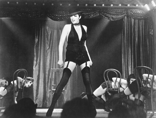
Next Thursday, 4 July, I'll be appearing at ACMI's "Life Is A Cabaret" event, associated with the Hollywood Costume exhibition. Hosted by Kip from Joy FM’s Cabaret Room, it'll also include the director of the Melbourne Cabaret Festival (which kicks off today) speaking on the history of cabaret in Melbourne, a performance of Liza Minnelli songs, and Clementine Ford doing a dramatic reading. I'll be talking about the costumes from the film Cabaret, and Weimar fashion more generally. It starts at 6pm and it's free!


Sunday 7 July is Wizard of Oz Day at ACMI and I'll be giving a talk about the costume designer, Adrian, who was one of Hollywood's most legendary designers. I will try to avoid shouting "ADRIAAAAAAN!" in a Sylvester Stallone voice but I'm not sure if I will succeed. I'll give you some background on his Wizard of Oz costumes in particular, and how they create character and drive the narrative in the film.

On Wednesday 17 July, I'll be doing a reading and book signing as part of the City of Melbourne's Look Stop Shop cultural program, themed 'Hot Stuff'. The fashion boutiques of Curtin House will be open late, and I'll be appearing at Metropolis Bookshop, the excellent art, design and pop culture specialist booksellers on level 3. I'll be reading from the book, so if you missed my Dog's Tales or Wheeler Centre readings, please come along. And if you'd like your copy inscribed, I'll be signing copies too.


And on Thursday 18 July, I'll be repeating my Elizabeth Taylor talk at ACMI. This is richly illustrated with pics of Liz's film costumes (especially Cleopatra), her wedding dresses, her groovy outfits from what I refer to as "the Yachting Years" and, most fabulously, her jewels! It went down quite well the first time and I surprised myself by how much information about Liz's life and style I had accumulated while researching.

Sunday, June 09, 2013

Who listens to the radio?

This past week I've been busily spruiking Out of Shape on radio. Last Monday I did Life Matters on ABC Radio National, which you can listen to here. On my computer, it worked best to choose the "download" option, which opened up a separate window where the audio played happily.

Thursday was another big press day. I began the day at Triple R chatting to the Breakfasters about the book. I was in there a fair bit over summer, doing "The Stupid Question" segment for The Enthusiast, so it was nice returning to familiar ground. Listen to the segment here.

Later that I chatted with Kelly Higgins-Devine for Statewide Afternoons on ABC Brisbane, and that interview is here.

Then after that I appeared on Rafael Epstein's Drive program on ABC Melbourne, as part of the regular "Culture Club" talkback segment, but I don't have any audio from that interview.

I've also chatted with Genevieve Jacobs for Mornings on ABC Canberra, Ian Henschke for Mornings on ABC Adelaide, and Kate O'Toole for Mornings on ABC Darwin, but I haven't yet found any audio from those spots online. 

I'm keeping track of all the reviews on the Out of Shape page rather than mention them all individually. So if you're interested, you can check 'em out there. If you use Goodreads, you can also link up with me there and follow what I'm reading.  

Finally, I'll be posting some of the fascinating stuff I couldn't fit into the book as blog posts over the coming weeks.

Thursday, May 30, 2013

A book teaser… and some nice early reviews

So Out of Shape is about to hit stores! It has already hit some stores: you can get it right now at Readings, and thanks to the lovely people who've tweeted and Facebooked pictures of their spanking new copies!

To get a taste of what the book is like, Kill Your Darlings has an extract online now. If you followed or completed my What Dress Size Am I? online survey, this is the bit of the book in which I reveal the results. I even went back to the Bourke Street Mall to subject myself to more judgey glances from shop assistants! That is how committed to my research I am.

The official release date is 1 June, and I know for sure it'll soon be available at Booktopia, Constant Reader, Dymocks, Bookworld and Brunswick Street Bookstore. If your local bookshop doesn't stock Out of Shape, please ask them to order it in. I'm kind of hazy about how book distribution works, but one thing I have noticed is that bookstores gauge whether to stock a given book by how many people request it.

Ebooks are coming soon, from Kindle, Kobo, iBook and Bookish, plus others including OverDrive. The official ebook release date is 3 June, but it'll be gradually rolling out over the next few days.

There will also be a Melbourne launch on Thursday 20 June… details of that to come. And I feel so lucky and pleased that reviewers seem to have liked it so far. Here are some nice things that people have already said about the book:

"A lively and personal waltz through the history and culture of clothing size and fit … illuminating and enjoyable." – Portia Lindsay, Books+Publishing

"This is exactly the type of writing that I love – intellectually charged, feminist and smart." – Jessica Au, Readings

"Out of Shape is a smart, meticulous and well-researched examination of clothes and society. It is a book that will inspire readers to think about their own relationship with what they wear" – Kylie Mason, Newtown Review of Books

"Out of Shape has slapped me in the face. Fashion doesn't mean just talking about the way things look. What about how things feel? … Mel slices up the broad topic of 'fashion and fit' with anecdotes, research and insight." – Marissa Shirbin, Three Thousand

Tuesday, May 14, 2013

"I'm sick of all these layers"

Just now, I was grumbling to myself about how annoying it was to arrange my clothes to go to the toilet. "I'm sick of all these layers!" I said.

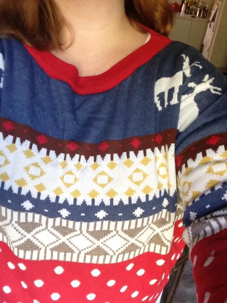
Today over the hip area I am wearing underpants, a singlet tucked into leggings, a stretch miniskirt, a T-shirt and a jumper. Can we please just pause the commentary right here to admire my new Christmas jumper:


I've yearned for a Christmas jumper for ages but I could never find any in the op-shops and cheap-shops I frequent. I stumbled across this one at Femme Connection and bought it immediately even though it's only synthetic. I plan to wear it every day, like Sarah Lund from The Killing. I really like the colours and it has reindeer on the shoulders! Now, back to your scheduled discussion…

Anyway, it takes a while to arrange these stretchy cotton layers so that they create the smoothest silhouette that most efficiently camouflages my flab. It is annoying to have to rearrange myself every time I go to the loo (says I, sipping from a pint glass of water).

But much as the Four Yorkshiremen would have dreamed of living in a corridor (it would have been a palace to them!), women in the past wore many more layers than me.


Here's Sally Field as Mary Todd Lincoln in the film Lincoln. In this costume she first donned a shift that went to just above the knee and stockings gartered above the knee. Over that she wore a corset, and then the tail of her shift was tucked – as I discovered last year – into her drawers. Over this she then wore a camisole, then over that her crinoline frame, then over that a petticoat, then over the whole thing, her dress. Sally Field and her costumer could get the whole get-up on in 15 minutes.

When I first read that, I wondered why the drawers went over the corset, then I realised that it's much easier to go to the loo if the waistband of your drawers is easily accessible rather than pinned down beneath your corset.

Recently I saw the French film Farewell My Queen, set at Versailles in July 1789.


Léa Seydoux plays Sidonie, a relatively high-ranking servant whose job is to read to the Queen. For almost the entire film she wears this two-piece silk dress (sometimes with a jacket over the top), but at the end of the film she's humiliatingly stripped naked in front of the Queen.

From a costume history perspective I really enjoyed this scene, because I got to see the layers of her costume. She didn't seem to be wearing a separate corset; the bodice of her dress must contain the boning and shaping. She also wasn't wearing drawers, but only stockings, shift, panniers and petticoat.

Farewell My Queen is fascinating because of its conceit of being present in the quotidian lives of people two centuries ago. It does a tremendous job of showing them at home in their clothes and surroundings; Sidonie is seen scurrying around the huge château, falling over several times. At one stage she's making out with a hot guy and they are ineffectually trying to remove each other's clothes; it's harder than simply pulling a T-shirt over your head.

However, let's not make the mistake of pitying the women of the past for their 'archaic' getup. Much as we do today, they just saw it as normal, and got used to the way their bodies moved and occupied space in their clothes.

Monday, May 13, 2013

Abercrombie and fit

There's been a brouhaha this week over the size range offered by US preppy teenwear company Abercrombie & Fitch, and comments by its CEO Mike Jeffries. Here's how the issue has been interpreted in the media:
"Not available in XL: Abercrombie & Fitch CEO Mike Jeffries accused of only wanting 'thin and beautiful people'" – The Independent (UK)
"Abercrombie & Fitch CEO's ugly quest for attractive 'cool kids'" – Los Angeles Times
"Abercrombie & Fitch only want your business if you're thin" – New York Post
"Abercrombie CEO slammed for refusing to sell women's plus sizes" – Edge Boston
This story is actually seven years old. It was back in January 2006 that Salon.com investigated the A&F company philosophy (including references to Friendster, LOL!). But the claims were revived in a recent Business Insider interview with retail pundit Robin Lewis.

Lewis reminds us that in the Salon interview, Jeffries had said:
we want to market to cool, good-looking people. We don't market to anyone other than that. … Candidly, we go after the cool kids. We go after the attractive all-American kid with a great attitude and a lot of friends. A lot of people don't belong [in our clothes], and they can't belong. Are we exclusionary? Absolutely.
Now some commentators – including Lewis – find this marketing strategy repugnant. At The Huffington Post, Andrea Neusner huffingtoned that as a parent of three "thin, attractive, all-American kids with great attitudes and lots of friends", she was so offended that she was donating their A&F clothes to charity and refusing to purchase more.

But A&F is perfectly within its rights as a retailer to define its 'target customer' however it wants. It's not in the business of pleasing everyone. It trades in a kind of sexed-up preppy aesthetic, in which shirtless, wholesome jocks and their girlfriends frolic in an eternally carefree, monied Ivy League youth. Kind of like what Facebook could've been if the Winklevii had had their way.


Lots of people seem to have the idea that clothing retailers are somehow conspiratorial in their sizing, deliberately gaming it to exclude those who don't fit the clothes, as it would be a 'bad advertisement' for the brand to let 'undesirable' people wear it. Kind of like jocks and mean girls bullying and ostracising nerds and fat kids.

That's just not how it works. Bad experiences with sizing and fit in shops are often the fault of poor customer service and unsympathetic retail design – in other words, the aspects of a clothing brand that have nothing to do with the actual clothes.

If Abercrombie & Fitch staff were trained to display a contemptuous, too-cool-for-school attitude and to belittle any shopper they judged to be 'not brand-correct', then that's an issue of customer service.

And if the store environment is alienating and intimidating, with shoppers made to feel like supplicants who have to prove themselves worthy to buy the clothes, then that's a store design and visual merchandising issue.

A given brand's sizing is actually based on the preferred size of the majority of customers. Any store's 'medium' size is always its bestseller; if a brand notices more 'smalls' or 'larges' being sold, that's a sign that its customer base is changing, and that the sizing needs to be tweaked.

While it may seem unfair to those who wear 'outlier' sizes, this is completely not a deliberate psych-out or an intimidatory or exclusionary tactic. And nor is it vanity sizing. It's an effort to streamline the costs of production so the brand is not wasting money making clothes that sit around on racks because they don't fit the average customer.

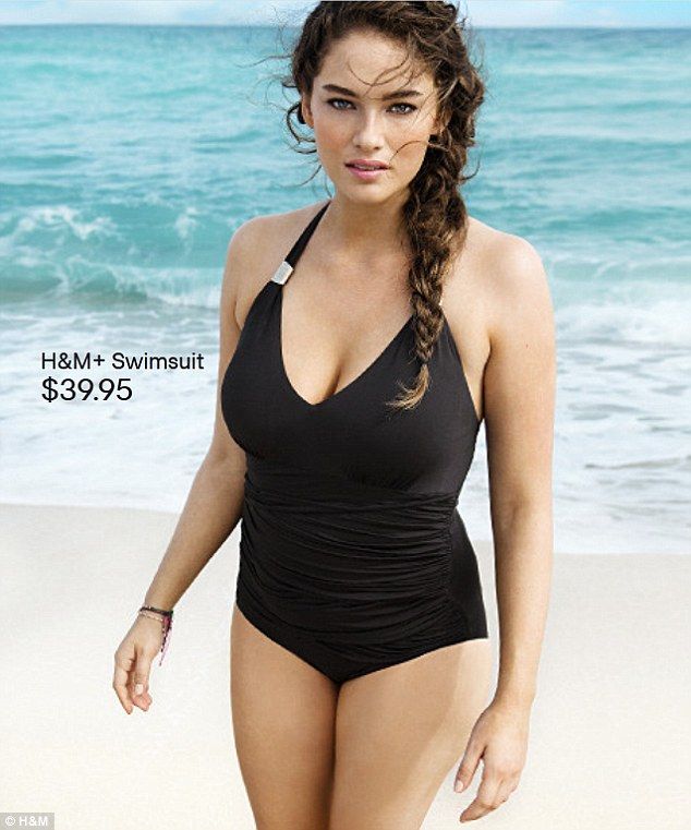
We often hear about how brands are pandering to the expanding market for plus-sizes by offering larger sizes, more cuts and mainstreaming plus-size models. For instance, Swedish fast-fashion brand H&M was recently praised for illustrating its swimwear using a plus-size model.


Plus-size model Jennie Runk models a pretty blah-looking H&M swimsuit

The media often present these actions as the brand's moral choices: choices that acknowledge the dignity and personhood of larger consumers, and that present the retailers as 'good guys'. But for the brand, sizing isn't a goodwill gesture; it's a marketing tactic. And a brand that clearly targets a particular consumer segment, then adjusts its sizing to fit these target shoppers, is making a strategic decision.

"Those companies that are in trouble are trying to target everybody: young, old, fat, skinny," Mike Jeffries said back in 2006. "But then you become totally vanilla. You don’t alienate anybody, but you don’t excite anybody, either."

Saturday, April 20, 2013

Out of Shape, into the world


Here's the cover art for my book, Out of Shape. Allison Colpoys did a lovely job, and I'm super pleased with Benjamin Law's quote. (More great design and quotes on the back cover, and inside!)

It'll be out in June, which is scarily not that far away. I'll also be speaking at a number of events over the next few months, so here are all the details:

ACMI's Hollywood Costume exhibition is opening on 24 April, fresh from its run at the Victoria and Albert Museum in London. Costume museums play a significant role in my book, as does clothing in film more generally. I was so excited by this show I was toying with the idea of travelling to London to see it, so you can imagine how thrilled I am that it's come to me instead.

There's an associated program of talks and events. I'll be speaking on a panel event called The Emperor's New Clothes on Sunday 5 May, along with costume designer Katie Graham (Wilfred, Small Time Gangster) and Dr Terrie Waddell, Senior Lecturer in Media and Cinema Studies at La Trobe University. It's about the role of costumes in developing a character.

I'll also be presenting a talk on Elizabeth Taylor on 21 May and 18 July, whose onscreen and offscreen clothes are so memorable. It's part of an ACMI package where you get to hear the talk and then go explore the exhibition. I've already been collecting images for my talk on Pinterest.

The Emerging Writers Festival runs from 23 May to 2 June. It's a favourite festival of mine because everyone is so friendly and it's genuinely focused on writing. I'm appearing at three events. I'm moderating a Writers' Conference panel on genre on Sunday 26 May, with Jane Harrison, Alex Hammond, Wayne Macauley and Alison Croggon. I'm also speaking at the Kill Your Darlings 'Late Night Live' panel about TV on Tuesday 28 May, and at the Express Media/Signal intensive workshop for young writers on 1 June, alongside Bethanie Blanchard, Amy Gray and Samuel Cooney.

On Monday 3 June I'll be reading from my book at Dog's Tales, a monthly storytelling night run by Angela Meyer at the Dog's Bar in St Kilda. Sharing the bill with me will be the very funny Lee Zachariah, who's also one of my film-reviewer buddies.

And hopefully, having got used to the idea of reading my work aloud, I'll be appearing at The Wheeler Centre's Debut Mondays on 17 June. Debut Mondays are held at booze o'clock (6:15pm) in the Moat bar in the basement of the Wheeler Centre.

Monday, April 15, 2013

Victorian wardrobe malfunctions

In my book I talk about two different sorts of authenticity we seek from the clothes of the past. There's 'archival authenticity', which is understanding the garments themselves, and the right ways and contexts of wearing them; then there's 'emotional authenticity', which is using clothes to explore what it might have been like to live in the past.

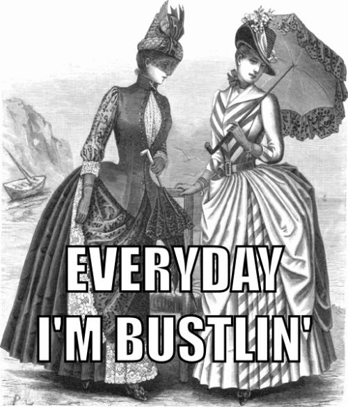
People who participate in cosplay or historical re-enactment societies often have the most detailed information about how to move and hold yourself in unfamiliar garments. I just found a fascinating video tutorial on how to sit down while wearing an 1870s or 1880s bustle dress.


The comments also discuss how to get through narrow doorways while wearing a crinoline. After steel cage crinolines were first introduced in 1856 they were the subject of much satire. This page of crinoline cartoons gives you an idea of some of the mishaps that could occur. Because they took up more space than the wearers were used to, they often did things like sweeping vases off tables with their skirts, or accidentally setting their skirts on fire by standing too near the fireplace.

Crinolines were also much lighter than the previous layers of stiffened petticoats. They tipped forwards and backwards like bells, exposing the wearer's legs and undergarments; and if a high wind got underneath, it could actually flip the crinoline up over the wearer's head. Under-drawers, which weren't always worn prior to the 19th century, became a compulsory aid to modesty.


This cartoon is from Cassell's Family Magazine, 1881 (or at least that's how it was labelled; I could write an entire other post about how we circulate wrong historical information through misdated and mislabelled archival material posted in social media). If that date is correct, then readers would understand the women in the picture to be wearing ridiculously old-fashioned clothes, underlining their hypocrisy in mocking the Regency outfits of their mothers.


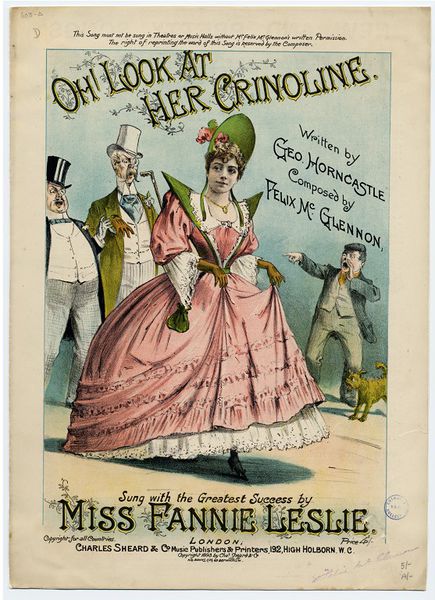
The 1893 music-hall ditty 'Oh! Look at Her Crinoline' was written by George Horncastle and Felix McGlennon and performed by Fannie Leslie, who was the queen of the English pantomime stage. As her 1935 obituary in The Montreal Gazette stated, "hits launched by her went all around the Empire."

It's basically 'My Humps' for the Victorian set. The lyrics read, in part:

Now when a young lady climbs over a stile,
Oh, look at her crinoline!
And when she turns 'round with an innocent smile,
Oh, look at her crinoline!
But when she goes out with dear Charley or Nell,
Or gets on a 'bus – well, I'm not going to tell,
But I'm sure that the boys will cry out and yell,
Oh, look at her crinoline!

CHORUS

Oh, boys, gaze upon her crinoline! Oh, boys, doesn't she look green?
If the wind should blow, would a poor girl have a show? Not on her crinoline!

What's interesting about this is that it's a nostalgic song. When it was written, crinolines hadn't been in fashion for about 25 years. This would be like a pop song about '80s fashion topping the charts now. Well, hang on…

Saturday, April 13, 2013

What we think we know about the past


Recently my friend Melanie sent me a fascinating link to a fabric design contest at Spoonflower, a website where people can design their own custom fabrics. They have weekly design contests: this one is "inspired by the idea of what life would be like in a Jane Austen novel."

Some designs are more 'professional' than others. Some are based on the kinds of patterns that would have actually been used in dressmaking in the early 19th century: delicate dots, stripes and sprigged patterns. Some designs incorporate Regency-style characters or other visual tropes. Some are more tangentially 'romantic' and don't seem to use a Jane Austen-style visual language at all.

This design, in particular, struck me. It is odd that it includes the word "pride" without the matching word "prejudice". I love the phrase "Do stay for Tea". But I was even more struck by the description of the design. It reproduces a lot of the 'commonsensical' assumptions about the past that I see a lot, and that really annoy me.
Dress, speech and conduct was finely tuned and comformity was essential. Being held in tightly by societys expectations is reflected in the corsets women of a certain class had to wear. Women had to have long hair, long dresses, cover their heads when out in public and maintain a 'certain appearance'. […] I would have fitted in as I enjoy doing tapestry and I like being treated like a lady and I do love and appreciate culture and refinement.
Because of the drapey Empire-line dresses, the Regency era actually had some of the shortest and least restrictive corsets in the 500-year history of the garment. Some women just wore quilted bodices with no boning. You'd wear a long-line corset only if you felt self-conscious about looking fat or wobbly in the thin, translucent muslins that were fashionable.

It is seriously weird how we somehow think that only the women of the past lived under crushing social expectations just because they wore undergarments that feel unfamiliarly tight and firm to us. The expectation to maintain a thin, fit, toned body is just as oppressive today, but it's less 'visible'. Maybe future people will shake their heads at the tyranny of fitness, symbolised by skimpy G-strings that mercilessly don't leave anywhere to hide.

Friday, April 12, 2013

The inspirational gaze

I just read an interesting post at The Peach about 'thinspo' and 'fitspo'. These are genres of images that are circulated through image-centric blogs and social networks including Tumblr, Instagram and Pinterest. But the line between these and 'pro-ana' (pro-anorexia) imagery is very blurred. Basically I see the terms 'thinspo' and 'fitspo' as interchangeable.

The idea of the images is to inspire women to become thin ('thinspiration') or fit ('fitspiration'). Some have superimposed aphorisms, like motivational posters, about the value of self-discipline and the deferral of pleasure.

Here are a few pics I found via a 'fitspo' search on Pinterest:


The point Holly Curtis is making at The Peach is that historically, women's magazines have controlled the production of aspirational imagery of women's bodies, but now women are photographing themselves. And they're accessing and circulating these images in much greater volumes than before, and in ways are much more pervasive.

It's no longer the responsibility of magazine gatekeepers to promote 'positive body image', Curtis argues – it's now up to us (the producer/consumers) to develop our own visual literacy so we can separate the 'healthy' from the 'non-healthy' images.

Some feminist fitness fans are seeking to do just that. Virginia Sole-Smith teases out the relationship of fitspo to its eating disorder-fostering antecedent, thinspo. Charlotte Anderson points out that "compulsive over exercise can be just as deadly as other eating disorders and yet it [is] so socially sanctioned that it’s often promoted as inspiring." At Fit and Feminist, Caitlin explains that she's inspired by images of women in action, rather than women posing passively for the viewer's gaze.

The first thing I'll say about thinspo and fitspo images is that they are an obvious example of what I call 'orthovestia'. They dramatise the idea that we're only entitled to appear in public if we continuously 'work on' our bodies through diet, exercise and judiciously chosen clothing.

These images divide people into 'winners' and 'losers'. Winners are those who train hard, deny their appetites, and are rewarded by being the objects – sometimes the headless objects – of the thinspo and fitspo gaze. Losers are those who 'give up', 'never try' or 'make excuses' and are relegated to longingly gazing at images they don't have the self-discipline to resemble.


What's striking about a lot of fitspo is the pitiless sameness of the bodies: they're very lean and slender, with flat, toned stomachs, protruding hipbones and large gaps between the thighs, yet still with plump breasts. Some images are closer to what we'd understand as bodybuilding or 'body-sculpting' images: the women have defined abdominal muscles, bulging shoulders, arms and thighs.

Traditionally, 'positive body image' campaigns have argued we should promote imagery of a diversity of body shapes and sizes. People who ascribe to the body image doctrine might argue that the antidote to thinspo and fitspo is circulating similar semi-clad images of other body types – pudgier ones; stockier ones; ones with bigger hips, or broader shoulders.

However, I take a more radical view. I believe that a gaze-based culture is inherently tyrannical, turning its citizens into objects to be surveilled and judged on their outer appearances. We erase the subtleties of being embodied when we place so much value on how a body looks. And we lose empathy for other people when we're taught to obsessively focus our energies on 'improving' our own bodies.

It is truly alarming that some women can only feel 'inspired' by gazing at pictures of other people's bodies. Any circulation of images of bodies is damaging; instead we need to cultivate ways of being in and talking about our bodies that aren't dependent on displaying them for other people's approval.

Monday, March 18, 2013

Mannequins aren't mirrors

You might have seen a photo circulated through social media of two underwear-clad mannequins in a display window of a Swedish shop called Åhléns. They were being praised for being "fuller-figured" than regular mannequins and hence reflecting… wait for it… REAL WOMEN! On the other hand, Reddit users were ridiculing the proportions of a plus-size men's mannequin.


For years now we have been having these stupid discussions. I even mentioned how stupid they were three years ago. The 'debate' about mannequin size is so repetitive for two reasons. First, we struggle to imagine and accept bodies that look different to our own. Second, and more importantly, we can't imagine ways to think about bodies in terms other than the visual.

Mannequins are a retail merchandising tool. They aren't mirrors. It is only because of a specific set of aesthetic decisions that these mannequins are even styled like realistic-looking humans. We can try on clothes just as well if they are displayed on plain hangers suspended from the ceiling by fishing wire.

Two weekends ago, when Melbourne was gripped by a heatwave, I was wandering around in Melbourne Central shopping centre because it was air-conditioned. I was struck by these guys, first because they looked so funny and cartoonish, and second, because they were the only mannequins I saw that looked remotely like people:


You aren't meant to look at a mannequin and compare it to your own body. Indeed, you shouldn't look at a magazine editorial spread and compare the model's body to yours! You should see them as jumping-off points for your own imagination. You should mentally dress yourself in the clothes. I'm constantly collecting pictures of clothes I like on Pinterest, but I will never resemble those pictures. My body just isn't like that.

It is childish to demand the world fill our line of sight with people who look just like us. The problem with any 'body image' debate is precisely that – its obsession with images. Instead – and this is much more challenging – we have to develop non-visual ways of understanding bodies. Ways that – for instance – are about what a body can do, or how it feels to be embodied and wear clothes. We need to empathise rather than scrutinise.

I read an essay recently that asked, "What's the point of running?" If we could pop a pill to instantly endow ourselves with all the health and beauty benefits of running, would we still do it? Well, I wouldn't, but some people run just for the fun of it. Too often, we see running as an instrumental activity – something we do in order to get something else. Our lives become meaningless if we constantly defer our pleasure and fulfilment to a time when we've done A in order to get B in order to get C, and so on. 

Similarly, we often see finding well-fitting clothing as something that can only be successfully accomplished after we lose weight, bulk up, get fit, become beautiful. And we're bombarded with cultural messages that our major value as successful social beings is in pursuing these instrumental tasks.

To return to the larger mannequins: they can be a smart merchandising tool. (Indeed, plus-size retailers need them because the clothes won't hang and cling properly on small mannequins.) My research has told me that people really hate trying on clothes in shops. So, anything that removes a psychological barrier between the merchandise and the customer is smart marketing.

But mannequins don't 'reflect' reality.

Wednesday, March 13, 2013

Fatness vs obesity

Today I have an op-ed at the Wheeler Centre in response to an essay by Karen Hitchcock in The Monthly. Hitchcock is a doctor treating extremely fat people whose ill health makes them candidates for bariatric surgery.

Hitchcock’s arguments about the adverse effects of being very fat and the fatal allure of ‘bad’ foods are alarming but persuasive, as are her clinical experiences with the strain that a large amount of weight places on the body. It’s certainly troubling that we are medicalising what is really a social issue.

But it’s hard to have a constructive public discussion about obesity when scientific research and medical authority are used as moral justification to shame and blame fat people.

In my book Out of Shape, I identify a rhetorical mode in public debate that I’ve dubbed ‘scienciness’. Just as ‘truthiness’ is something that feels intuitively true without requiring any evidence, sciency writing uses the language of science to normalise the judgments we make about other people’s bodies.

Hitchcock’s essay was frustrating for me because she understands the way culture works on us, yet in her position of authority as a doctor she also regurgitates its worst messages. She lists the tools of her trade – ‘our ears, our voices, our hands, our pills and our scalpels’. But she leaves out the most important – her eyes.

Read the rest at the Wheeler Centre site.

Friday, March 08, 2013

Interview: Kate Millett of Bombshell Vintage

Kate Millett runs Bombshell Vintage, a Melbourne store specialising in plus-size vintage clothing. I discovered it when Fashion Hayley blogged about the launch of Bombshell's first shopfront in Clifton Hill.

A year later, Bombshell Vintage now operates from the Lost and Found Market in Collingwood. And Kate is celebrating its first birthday on Saturday 9 March at the LuWow, 162 Johnston Street Fitzroy from 7:30pm. There'll be delicious tiki cocktails, curvaceous go-go dancers, and a catwalk show featuring Bombshell's wares as well as clothes from local designer Fox Parse and fellow plus-size vintage sellers, Hey Fatty.


Kate models her favourite festive vintage outfit. Image: Bombshell Vintage

Mel Campbell: How did you get into the vintage retail business?

Kate Millett: I was a vintage aficionado for a long time before I ever thought of starting a business. I always wanted someone else to do it so I could just take advantage of their effort! I was the one telling vintage store owners to sort their clothes by size so I wouldn’t have to waste my time pawing through clothes that never went higher than a size 12…

And then I went through six months of being unemployed and I thought to myself, "Well, I’ve got the time on my hands. Just start doing it. Keep it small and so if it fails, you won’t have lost much." And then it just grew from there!

And what's your approach to vintage now – do you see yourself as a collector, or a savvy shopper and trader, or an advocate for plus-size fashion… or something else?

I see myself as something of a collector, a bit of a hunter, and definitely an advocate for plus size fashion! I love finding new designers to show people that it is possible to be larger and dress beautifully! I love hunting for new bargains. I will spend the extra hours going through multiple op shops to find those little hidden treasures.

What do your clients or shoppers tell you they value most about a shop like Bombshell Vintage?

All the clothes I stock are interesting, either because of the colour, embellishment, texture or the shape. I help people find clothes that reflect their personality and rediscover the joy in fashion – the fun in playing dress-up every day! My customers use my store to find one-off special pieces they can then integrate with the rest of their wardrobe to make it a little quirky, a little bit more interesting.

I guess the main thing about my store is that it gives them the freedom to explore fashion without judgement, a place where they know they can find clothes that are gorgeous just for them!

I've always been fascinated by how much plus-size vintage is still out there, and how easy or difficult it is to find. (In its early stages, my book had the working title 'What Fat Chicks Used To Wear'.) Where do you get your stock?

It’s not the easiest thing of all time. You have to be willing to scrimmage through warehouses of clothes to find awesome stuff that’s also plus size. Now that we can search via the internet, that search is getting a little easier, although that does mean you can’t personally inspect the stock for things like poorly stitched seams, stains or tell if it’s a reproduction rather than the real deal. You have to build relationships and trust between yourself and suppliers to ensure you get the best stock possible. These days most of my stock is from a few second-hand warehouses, with a few special items bought over the internet.

I found most of [my suppliers] by exploring every op shop/second-hand store in my area, thanks to this website. The others I found by driving past them every day on my way to work and then finally deciding to check them out. Second-hand stores can look pretty dirty from the outside!

Does plus-size vintage have much of a presence here in Australia compared to straight-size vintage? I understand it's quite a thriving vintage segment overseas – I've heard fabulous tales of giant plus-size vintage warehouses in Brooklyn…

In Australia, plus size vintage pretty much doesn’t exist by itself. One or two places do stock it alongside straight sizes, but even then it’s only a few pieces. As far as I know, there’s only myself and Hey Fatty who are specialising in plus size vintage full time. There are a few Facebook groups popping up to help plus size women clothes swap, et cetera, and a few people have started doing market stalls, but it’s still a rarity.

I’m travelling to the US and Canada later this year… I really hope those tales are accurate!


Fancy wares at Bombshell Vintage's stall at Lost and Found Market. (May I draw your attention to that covetably Stam-like handbag on the wall?) Image: Bombshell Vintage

What kinds of items do you find a lot of when you're sourcing stock? Do you find certain labels or brands are well represented in plus-size vintage?

Thankfully, most types of clothes are available in plus size vintage if you look hard enough. The only thing that’s really missing are pants that aren’t awful!

In terms of labels, there are a few that keep popping up and are indicators of good quality clothes – Lane Bryant and Diane Freis come to mind. Diane Freis’ dresses are almost more artwork than clothing… I love her clashing prints and amazing pleats!

What proportion of your stock would be home-made?

Quite a bit of it. Especially when you’re talking about clothes from before the '60s. We also get a lot of stock that has been altered again and again. Something that may have started out as a store bought frock ends up looking like something homemade because practically every seam has been changed!

What are the idiosyncrasies of vintage sizing that shoppers might not be familiar with from contemporary garment labels? Do you see much of the old half-sizes and OSW, EOS and XOS sizes, or European numbered sizes?

We don’t get a lot of the European numbered sizing. The OSW, EOS, etc only really shows up in a few styles of clothing – it’s not very common. The half sizing is everywhere! I tend to ignore vintage sizes… They seem to change from brand to brand!

It's kind of a truism of vintage shopping that older sizes are much smaller than their contemporary equivalents. Personally I disagree that this is 'vanity sizing' at work – I see it as more a 'sizing evolution' as the population has got older, taller and heavier – but what do you think, based on your experience?

Vintage sizing is very different from modern sizes… I think the change comes from evolution, like you said, but also maybe from trying to combine two or three different methods of sizing.

I think it's about the sizing systems changing. Companies were starting up who didn't want to use the old systems of sizing - the half sizes, the XW method - and needed something to use. I think the sizes have also grown as the population has. We are now taller and broader than we used to be. It's a different way of looking at sizing. I don't think it's a vanity thing, I think it's a natural growth out of the old systems. The next step is for them to all be standardised...


More colourful merch at Bombshell Vintage's stall in Lost and Found Market. Image: Bombshell Vintage

Friday, February 08, 2013

"Look at this guy and know…"

Today I found this article about New Jersey Governor and Republican presidential hopeful Chris Christie, who's being publicly shamed about being too fat to run for US president in 2016.


Chris Christie on The Late Show with David Letterman. Image: Telegraph (UK)

Basically, he went on Letterman and good-naturedly joined in the host's fat jokes. It's odd, but no commentators yet seem to have situated this donut-chomping incident in the context of talk-show guests always being encouraged to join the hosts in silly jokes and stunts of this nature, often at their own expense.

But because Christie is fat, commentators have interpreted his participation as his not taking his health seriously. He had to address the issue in a press conference: "The idea that somehow I don't care about this – of course I care about it, and I'm making the best effort I can," the governor told reporters.

The drama was stoked by comments made by Dr Connie Mariano, who was the White House physician to George HW Bush, Bill Clinton and George W Bush. Mariano told CNN, "I'm worried about this man dying in office."

However, at the press conference Christie hit back: "I find it fascinating that a doctor in Arizona who has never met me, never examined me, never reviewed my medical history or records, knows nothing about my family history, could make a diagnosis from 2400 miles away … [P]eople who have a medical license, who have the privilege of having a medical license, should in my view conduct themselves more responsibly than that. If she wants to get on a plane and come here to New Jersey and asks me if she wants to examine me and review my medical history, I’ll have a conversation with her about that. Until that time she should shut up."

Christie is absolutely right. His appearance has nothing whatsoever to do with his ability to do his job, and his health is not the business of anyone but him and his doctor. But when a fat person reaches a position of public prominence or authority, our responses are often limited to moral panic about 'obesity'.

In a culture obsessed with outward appearances, someone's fitness for public office dovetails with their physical fitness. We find it really difficult to believe that someone who looks fat on the outside could be fit on the inside. And we worry that even tolerating fatness in public sends an unwelcome message that it's acceptable to be fat.

I think it's interesting to see this happening to Chris Christie, because we often associate fat-shaming with misogyny. But clearly it happens to fat men as well as fat women.

In my book, I spend a lot of time on two key concepts: orthovestia and scienciness. Orthovestia, a term I've coined from the Latin for 'correct' and 'clothing', is the cultural notion that only ideal bodies are allowed to be seen in public. We learn what is and isn't ideal through pop culture, and are taught it's our job to use diet, exercise and 'flattering' clothing to maintain an ideal figure, to make ourselves more like the ideal, or camouflage that we aren't.

Orthovestia works through the act of looking. From an early age, we are trained to gaze and judge: at our own bodies; at the bodies of celebrities; at the bodies of strangers. The negative judgments we make about fat people, very skinny people, or people whose clothes we believe are too tight or baggy, too skimpy or see-through, are expressing our belief that they're unsightly. We don't like looking at these bodies, so we demand that they discreetly withdraw from view.

Scienciness, meanwhile, is a mode of rhetoric in journalism that uses scientific language, and strategically deployed quotes from actual scientists, in order to police cultural ideals. Sciency journalism is different to scientific journalism, which is the reporting of scientific research to a general audience. Rather, sciency writing is a technique for making orthovestic judgments seem indisputably correct. Think of it as being similar to 'truthiness', which is something that feels intuitively true without requiring any evidence.


I mean check him out! He's, like, twice the size of Obama, so he's, like, half as likely to be president! It's true because science!

So, we subject Christie to our gaze. And because his fatness is undeniable, and because doctors and researchers are constantly telling us obesity is unhealthy, we 'diagnose' him from afar the same way Dr Mariano did.

As commenter Raphaela V wrote at ABC News (with my emphasis):
"…it doesn’t take even a medical license to look at this guy and know all the things the doctor said are true. If he’s that irresponsible with what goes in his mouth, he’s going to be that irresponsible with any responsibility given to him."
Fat people are held to much more rigorous standards of health than thin people. This is because we can't 'see' unhealthiness in thin people the same way, so we don't fret about their fitness to hold public office. Fat people, however, have to perform their fitness in public.

This is why Christie was under such pressure to tell journalists his "plan" to lose weight – he has to be seen to be doing something to become less unpleasant to look at. Under orthovestia, it's simply unthinkable that someone has better things to do than change the appearance of their body. So along with being told we look bad, we're fed imagery of makeovers, weight-loss successes, and how to 'dress for our shape'.

Monday, February 04, 2013

Regency camel toe

Further to my previous post about men's trousers in the early 19th century, I have discovered a genius blog. It's called Regency Camel Toe.


What I love about the blog is the collision between sartorial history and what we now think of as a sexualised wardrobe malfunction: the camel toe. Although 'camel toe' (sometimes spelled 'cameltoe') is usually understood as something that only happens to women; in the book I primly distinguish between "‘cameltoes’ (clothes wedging in the crotch to reveal the outlines of a woman’s labia) and ‘moose knuckles’ (the equivalent reveal of a man’s penis and testicles)."

But the joke of Regency Camel Toes is that what looks like a camel toe is sometimes just the loose, bunchy material of the trousers. You can see that back in the day, men's trousers weren't at all snugly tailored over the torso; they were really quite drapey.

In a lot of the Regency period drama productions featured on the blog, the baggy pants look different to the illustrations of the period itself. That is, the pants drape like today's tracky dacks, their bagginess revealing the merch in silhouette.

This reminds me of the men's drop-crotch pants that are quite popular with a certain kind of fashion-forward young dude – I've seen African teenagers and Asian international students wearing them. Yesterday on the tram there was a guy whose crotch was so dropped that he could sit down and rest his hands on his lap as if he was wearing a skirt.

Anyway, 18th and 19th-century pants didn't have a vertical fly; rather, the fly was a horizontally attached flap that buttoned closed at the waist, which evolved from the earlier codpiece. This is known as a 'broad fall' or 'fall front'. Later in the 19th century the hybrid 'split fall' emerged, and finally the vertical fly.

In erotic prints of the time you can see the flap hanging open for the dude to access his junk.


This is a reproduction – it's painted on the men's toilet wall at LMNT in Hackney, which bills itself as "London's most eccentric dining room". I have pixelated out the dude's junk.


This is a French lithograph, possibly by Achille Devaria (1800-1857), dated from somewhere between 1830 and 1849. I think this guy is trying to take a leak in the bushes and discovers that lady checking out his sugalumps.

Lederhosen and some traditional military uniforms still use fall-front fastenings.


Those 'sailor-style' pants with the two rows of vertical buttons on the front are references to this style of pants.

Thursday, December 27, 2012

Beau Brummell: Lord of the pants

The widespread adoption of trousers – or 'pantaloons', after the commedia dell'arte character Pantalone – was literally revolutionary. For centuries, wealthy men had worn draped robes, or breeches and hose; trousers were a peasant garment. But they became the sartorial emblem of the militant working-class sans-culottes ('without knee-breeches') who had acted as French Revolution footsoldiers.


A sketch of a sans-culotte. They were often depicted in red, white and blue striped pants, with red caps and tricolour sashes.

After the Revolution, trousers (along with unpowdered hair cropped short in the 'Roman' style) became the mark of wholesome republican masculinity in France, as opposed to the decadent royalist effeminacy implied by breeches. Cut so slimly they almost resembled leggings, they were sometimes worn with a stirrup strap under the foot to achieve a fashionably 'classical' tautness.


"You could really be a Beau Brummell baby if you just gave it half a chance" – Billy Joel

More than any other individual, George Bryan 'Beau' Brummell was responsible for transforming this look into the uniform of the English dandy. Like Coco Chanel, Brummell was a self-made social climber in deliberately simple clothing; this middle-class lad eventually became close to the Prince Regent, the future George IV.

He stood out from and fascinated the Georgian aristocracy with his fastidious attention to personal hygiene and his taste for unadorned, fitted dark coats, pale buckskin trousers, crisp white shirts, carefully knotted cravats and shiny boots (which he recommended polishing with champagne).

Despite spending fabulous sums on a relatively unassuming wardrobe (Brummell reckoned someone could be tolerably well dressed on an annual budget of around £800, or around $162,400 in today's money), his consumerism was never splashy or hedonistic. Rather, Brummell was soberly devoted to the pursuit of subtlety and distinction in dress and manners.

However, Brummell's decline began when he turned his ever-impertinent wit on his patron. Snubbed by the future monarch at an 1811 ball, he retaliated: "I say, Alvanley – who's your fat friend?"

Surprisingly, he maintained his popularity even after falling from royal favour, but his finances had never quite covered his exorbitant lifestyle. His dad William died in 1794, leaving Beau a £30,000 fortune (£2.69 million in today's money) that his expensive lifestyle completely frittered away in just over 20 years. In 1816 he fled England to escape his creditors, dying in poverty in France in 1840.

This was a most ironic fate indeed for someone who had made dandyism such a decidedly English masculine ideal. Dandies situated themselves in opposition to an earlier kind of Georgian hipster – the macaroni, a term that had arisen in the 1760s when wealthy young men who'd tasted Italian food on their travels abroad adopted ostentatiously 'European' dress and manners once they got back home. (The song 'Yankee Doodle Dandy', written around 1755, makes fun of trashy Americans who thought all it took to be cool was to stick feathers in their hats.) Anything elaborate became very bad taste in England after the French Revolution.

The 19th century is often understood as the era of wasp waists for women, but a cinched waist was also considered the height of manly beauty. Perhaps Brummell's 'fat friend' resorted to a corset or girdle to look good in his clothes, as a significant minority of Regency men did. The rich fabrics and stiffly upholstered layers of 18th-century menswear had made pretty much everyone look stout, but Brummell's favoured silhouette was svelte and body-hugging.


During an 1808 battle against Tom Cribb, future publican Bob Gregson "refreshed himself with a tumbler of brandy".

Perhaps one reason their pants were so tight was that dandies celebrated the physical body and considered prize-fighters or 'pugilists' to be prime specimens of manhood. As we've seen, the outfits boxers fight in have had a profound influence on menswear silhouettes.

One favourite, the Lancashire giant Bob Gregson, retired in 1810 and became the publican at the Castle Tavern in Holborn, where dandies loved to drink. It would be like today's hipsters hanging out at a pub owned by a retired indie singer-songwriter.

Cool dudes in skinny jeans, sometimes even in women's jeans, are the cultural heirs of Romantic heroes in tight pants, from Mr Darcy to Lord Byron to Prince Albert. Indeed, pop and rock stars beloved of teenage girls often wear tight clothing to make spectacles of their youthful bodies. In a reversal of John Berger's theory that men look while women merely appear, the boys are the ones being ogled and objectified by lusty female fans whose behaviour is unruly and unpredictable.

A contemporary observer will notice that in the 19th century, tight pants were actually quite baggy in the crotch. The folk mythology invented for the Prince Albert genital piercing (that it tucked his tackle neatly away in order not to spoil the line of his pants) isn't at all true.

Fascinatingly, current boy band sensation One Direction wear their skin-tight jeans just as baggy in the crotch. But while Regency pants were high-waisted, young men these days (and don't I sound a thousand years old as I write that) will wear their tight pants very low on the hips so that the putative 'crotch' of the pants actually sits more over the upper thigh. The waistband of their underpants is exposed, and sometimes large portions of the undies themselves. The look creates an optical illusion of elongated torsos and truncated legs.


Compare this look to the Ramones, whose tight pants are body-conscious in a way that looks almost feminine. Maybe it's because they were such unbelievable poseurs, standing with spread legs, cocked hips and thumbs in pockets in the way we're used to seeing women pose for men's magazines.