Showing posts with label trends. Show all posts

Tuesday, November 05, 2013

Spring racing fashion

Today is Melbourne Cup Day. Yesterday I did an interview about Cup Day, fashion, gender and consumerism with Lourdes García Larqué for 3CR Community Radio – it was broadcast on today's Breakfast program (I'll post the link once I know what it is). Since then, I've been thinking some more about the issues we discussed.

I find it hard to get excited about spring racing fashion because I believe racing is a cruel pastime with troubling inbuilt class politics. For me it's like enjoying the Duchess of Cambridge's fashion choices when she represents a system of inherited privilege that locks up much of the UK's wealth in the hands of a family whose only purpose in life is political symbolism.

Marieke Hardy wrote an opinion piece for The Drum back in 2010 calling the Melbourne Cup "a truly revolting spectacle". Hardy's anti-cruelty sentiments are laudable. There's really no excuse to celebrate the use of animals for entertainment and the miserable treatment that goes with this. I mean, Black Beauty, written to 'humanise' horses so readers could empathise with their lives as chattels, was first published in 1877.

But I was startled by – and uncomfortable with – Hardy's repeated, contemptuous references to racegoers' dress and behaviour. They dress "like a complete twat with scant regard to the weather forecast", with "streaky fake tan or idiotic, impractical headwear". And these "freezing cold idiot women toppling over in muddy, undignified heaps, the natty prats in matching comedy waistcoats blearily waving cans of Bundy about", will find themselves "eventually teetering home covered in a fine spray of puke and semen".

Wow. Apart from the language, we can tell this is about setting up boundaries between Us and Them because the magic word 'bogans' also comes out!

Hardy makes an unpleasant slippage here between class and cruelty, implying that finding racing cruel requires the same cultural capital as 'dressing well'. This seems odd considering that racing is 'the sport of kings' and is just as popular with toffs in the Birdcage, Members and corporate marquees as with the stumbling general-admission masses in their dishevelled apparel.

We go to the races seeking something glamorous, special, out of the ordinary… but too often, as Hardy ably sketches, we're instead put back in our class boxes and told we're dressing and behaving 'wrongly'. Tomorrow we'll see the traditional 'aftermath' photographs of people sprawled on the racecourse amid abandoned rubbish; of people throwing up; of women walking barefoot, having removed their high heels, and women huddled in their male companions' jackets, having not brought their own.

These are the shaming photos. Men's clothing is frowned upon as incompetently chosen: their suits, ties, shoes, hats and sunglasses are deemed 'loud', 'ill-fitting' and 'inappropriate'. Women are basically slut-shamed for dresses that are too short, too low-cut or that flip up in gusts of wind, and for dressing for vanity rather than practicality.

Janice Breen Burns, the former Age fashion editor, warned in 2006 that racewear is very different to fashion: "It's not as sexy, for one thing. It's neater, more controlled. Things match, knees are covered. Cleavage is a no-no."

Even last year, she tutted retrospectively about the dress of youthful racegoers: "poppets in string-strapped, knicker-flasher frocklets…had flooded out of the sparkly nightclubs and year-12 formals and on to trackside lawns." Still, JBB did concede that Fashions on the Field has since evolved.

In 2011 the Sydney Morning Herald's Luke Malone described spring racing season as "Schoolies for grown-ups": "The end result of a day sipping sparkling wine and sinking beers in the often sweltering heat sees men walking around with their flies undone and women with high heels in hand as if it were 2am after a night out in Kings Cross."

Malone's article is interesting because, while it also presents racegoers as infantilised consumer dupes, Malone suggests a certain festive permissiveness. As his anonymous friend says: "A couple of years back at Melbourne Cup I saw a pair getting hot and heavy right by the track - complete with hands-under-clothes action. There were easily 30 people watching and laughing yet it didn't seem all that inappropriate at the time. Everyone is always in good spirits. You never normally see people get that drunk without a fistfight breaking out."


These are the kinds of images that we often see at Melbourne Cup time; of all the days in Melbourne's spring racing carnival, it's the most carnivalesque. Because the Cup is a public holiday and is said to belong to 'everyone' – it's "the race that stops a nation" – many people feel they can dress and behave in ways that ridicule and upend traditional hierarchies and morals… including those of gender and taste. You'll see people dressed in drag, as animals, in parodies of traditional racewear and in matching outfits.

I'd suggest that perhaps these marquee race meetings offer 'ordinary' people opportunities to be carnivalesque by temporarily dressing as our 'betters', borrowing the dress and habits of the 1%. It's not just about the clothes, but also about betting, eating fancy foods such as chicken sandwiches and smoked salmon, and drinking champagne.

There aren't many similar events like these, for which to plan and enjoy wearing elaborate clothes and to consume conspicuously – especially for people who've left university and its cycle of balls and 21sts. Even at weddings, people rarely wear hats any more, and the evangelical churches that are now popular with churchgoers (as 'traditional' churchgoing declines) encourage attendees to wear casual clothes rather than 'Sunday best'.

Looking through The Age's photo gallery of today's event (photos by Eddie Jim, Justin McManus, Wayne Taylor and Angela Wylie), I was struck by the way that racewear has developed its own logics, separate from the dictates that made it so shocking in 1965 when Jean Shrimpton wore a short dress with no hat, gloves or stockings.


Look at this doll! Doesn't she look young and gorgeous? There's something festive and joyous about the bright colours chosen by some younger racegoers.


This is Joanna Stanes on her way to the Cup. I like her bold lipstick compared to the subdued colours and textures of her hat. She looks both romantic and modern. I also like that she's wearing a hat rather than a fascinator.


This is a rather ladylike, vintage-inspired look (and a stunning photo by Justin McManus). The popularity of Mad Men and the general interest in mid-20th-century culture has driven a return to these styles. I've also noticed that brides in my social circle who favour a vintage aesthetic tend to prefer fascinator-style veils to traditional wedding veils.

The demureness and prescriptiveness of much midcentury fashion dovetails with our cultural associations of racewear with 'correctness' and 'classiness'. Usually I loathe the term 'classy' as one of those words that actually connotes its exact opposite, but here it's appropriate because people are often striving for a certain class fantasy of being wealthy and privileged.


I also noticed several different strands of women's racewear emerging. You can see these two sartorial approaches here: an edgier style in terms of colour and silhouette, compared to the classic racewear on the right. We can't see their faces, but I assume the woman on the left to be younger than the woman on the right.


I like that these two girls seem to be matching each other's outfits. Perhaps their hemlines are 'inappropriate' but they look so happy!


Deborah and John Quinn demonstrate a fun way to dress up when you're older. Deborah is a well-known millinery collector; she's in her element here. They have opted for traditional 'rules', but don't look fusty and conservative. I especially love the way that Deborah's sunglasses and gloves match John's buttonhole and waistcoat – which are the traditional yellow of Melbourne Cup Day.


By contrast, these are quite old-fashioned racegoers; their outfits are quite fussy and froufrou. I love the centre lady's pillbox hat; I wonder if it's her own vintage '60s number.


This is a good example of what many younger racegoers now consider appropriate: they're wearing flowers in their hair rather than hats; their skirts are very short (what Janice Breen Burns would call a 'frocklet'); and the fabrics are quite slinky and diaphanous in a way we associate with cocktail wear rather than daywear.


Like many celebrity racegoers and Fashions on the Field entrants who are professionally dressed by stylists, Lauren Phillips is wearing what we could call 'contemporary conservative': a sculptural but minimalist hat and a well-fitting, tailored dress that doesn't show too much skin.

Contemporary conservative (or 'contemporary corporate') is a style of racewear that doesn't really take risks: it's not exuberant like a lot of young people's racewear. You see it a lot in photos taken at the corporate marquees, and on models, invited guests and others who are at the races in a professional or promotional capacity.

Despite the boldness of its hats, it's not very whimsical or individual. When you see a number of different celebrities dressed this way, you notice the sameyness, even down to the position and angle of the hats.


For instance, here are model Jennifer Hawkins, sass&bide designers Heidi Middleton and Sarah-Jane Clarke and football WAG Rebecca Judd at the Melbourne Cup in 2011.


And here are Hawko and Juddy at last year's Oaks Day, flanking Kris Smith, who I believe is best known for having once dated Dannii Minogue.

Tuesday, March 27, 2012

Retro retro

So, Mad Men has just started up again in the US, sparking a fresh wave of general '60s nostalgia. But we shouldn't fall into the trap of thinking we are the first people ever to idealise the past.

The films Midnight in Paris and The Artist, along with ABC TV's series Miss Fisher's Murder Mysteries, have sparked renewed interest in 1920s style; I found the images from my previous post on anachronistic fit while researching my Phryne Fisher costume for a costume party. No doubt Baz Lurhmann's version of The Great Gatsby will fuel the fire when it comes out early next year.

But as Lizzie Bramlett reminds us at The Vintage Traveler, the 1974 Robert Redford/Mia Farrow Great Gatsby film was just part of a general wave of 1920s and 1930s nostalgia during the 1970s. Art Deco, which had languished in popularity during the Atomic Age, enjoyed a comeback around this time, and there was a renewed interest in Golden Age Hollywood.

Take paisley, for instance. I associate it with '70s hippie clothing, and men's casual shirts in the 1980s and early 1990s. This picture, which I found at 'Ivy style' menswear blog The Trad, is from 'Clothes with Style', a 1985 article by legendary New York fashion journalist Robert Bryan, in the January 1985 edition of M magazine.


"It doesn't take a Douglas Fairbanks Jr to know that … a paisley shirt and khaki trousers are indigenous to a Saturday afternoon stroll," Bryan writes. Indeed.

But as this truly amazing visual history of paisley illuminates, it first entered Western fashion from Persia, via India, in the first part of the 17th century. It was so crazy popular that a French royal decree banned its import between 1686 and 1759.

Whether imported, made in Europe or brought home from India by soldiers and colonialists as souvenirs, cashmere shawls with paisley weaves became status symbols for women by the early 19th century. The English term 'paisley' comes from the central Scottish weaving town that came to specialise in the textiles.


Empress Josephine, 1809

During the Victorian era, paisley shawls were a common outer garment for women. Old shawls were also used as linings in newer garments, or cut up and DIYed into informal robes and jackets like this one from 1890:


By the 1960s, paisley had gathered counter-cultural associations – perhaps because the Beatles and psychedelic rockers had reignited interest in India (the psych-rock influence is clear in Prince's 1985 song 'Paisley Park'), or because hippies were generally into 'ethnic' and 'folk' motifs? Perhaps it's with these connotations in mind that Faye Dunaway wore a paisley bandanna in 1967 to portray 1930s rebel Bonnie Parker.


All these layers of retro associations in one image. Paisley's use in bandannas also took on other contexts when these scarves were used as signifiers of gang colours. Snoop Dogg has never stopped Crippin'…

Thursday, May 06, 2010

Sitting this one out


This is a "babydoll" dress currently being sold at one of my favourite places to shop, Big Dubs. Here is Fashion Hayley wearing the same dress (I'm sorry for reproducing a dodgy photo of you, Hayley!):


Here's another pic of Hayley wearing a very similar dress (that Big Dubs probably copied), which is a Topshop design for Incu.


When I saw the dress in Big Dubs I was quite excited because I love floral dresses (and paying as little as possible for my clothes). However, when I tried it on, it looked really terrible on me. As far as the waistline it fitted me well, but I was unhappy with the spot at which the waistline hovered: lower than the empire-line spot under the bust, yet higher than the true waist.

I also didn't like the shortness of the full skirt. I felt it made my body proportions look weird. Personally – and this is just my own taste – the only sort of short skirt I would wear is a straight or stretchy one. I like a full skirt to hit my knees; I think it looks better proportioned that way. I'm not a child, I don't find childlike whimsy appealing, and I don't want to dress in a doll-like or childlike way. A full short skirt just reminds me of retro-styled childrenswear, like something Sally Draper would wear in Mad Men:


When I saw Patty Huntington's pics from this year's Jayson Brunsdon show at Rosemount Australian Fashion Week, I was appalled at how short he has cut his full skirts. I don't even think they look good on the models with their coltish legs.


(Image: Patty Huntington)

But anyway. I know that Hayley does favour short skirts, and I'm not having a go at her sense of style. But it infuriates me that it's almost impossible to find a knee-length skirt in the shops at the moment; they're either these short babydoll styles or long maxidresses.

I also found it very difficult to warm to The Uniform Project because of how short the chosen dress was. It's definitely not a style that would look good on many people, although I can appreciate that it adds more versatility to the project because it can be worn as a long-line top as well as a dress.

(This is only tangentially related, but I'm fascinated by trends in the lengths of girls' school uniforms. When I was at school they tried their hardest to stamp out short skirts; the rule was that it had to touch the ground if you knelt. But now I see girls wearing ludicrously short skirts. Oddly, I also see the opposite, especially with winter uniforms: the skirts will be so long they're almost ankle-length.)

I'm using this dress as an example of the practice of "sitting this one out". This is a high-level stylistic knowledge pertaining to your own relationship with fashion cycles. You not only recognise that certain styles are 'fashionable' but also which styles suit you, and you make a tactical decision not to buy, to wait until fashion returns to the things that look good on you.

Right now I'm wearing a black babydoll dress with a cream-coloured 'doily' lace decoration across the bust. I bought it from Valleygirl perhaps three or four years ago now and have got a lot of wear out of it since, making a mockery of their 'fast fashion' ethos. I like it because it's elasticised directly under the bust and is gathered, so it glides flatteringly over my midsection. It falls to just on my knee.

Over the top I'm wearing a slouchy red cardigan from Jay Jays. I remember when I bought it at the start of last year, I just really wanted a red cardigan and settled for this one. I'd wanted a preppy, tailored style and was annoyed that it was long and loosely fitted, which happened to be the style at the time. So, I didn't sit that one out; instead I compromised. But now I'm enjoying wearing the cardigan, because this winter I've really got back into the grunge silhouette I used to favour in high school: leggings and short, tight skirts with oversized, slouchy T-shirts, flannel shirts and cardigans.

Sunday, July 26, 2009

The Beautiful And The Damned


Zac Posen For Target: A replica of the Posen evening dress Katherine Heigl wore to the 2007 Emmy Awards. Only 50 of these dresses were made for Target, retailing at $299.99.

When fashion designers – or fashionable celebrities – “collaborate” with retail chains, it raises intriguing questions about the value we place on “designer clothes”. Just as the movie industry has invested heavily in logics of auteurism, so fashion’s fulcrum is the notion of a single creative vision, distilled in the ‘label’ and personified by the ‘designer’.

These collaborations owe their frisson to the presence of a famous name in a mundane retail environment where it usually doesn’t belong. Linking themselves with labels and designers adds a certain gloss to downmarket retailers.

In return, designers get to grow their brand without having to use their own logistical and marketing resources. The bargain is especially tempting for emerging designers.

Some collaborations operate more like designer diffusion lines exclusive to one retailer. There’s Ksubi’s Alba Fan Club, sold only at Jeans West, and in August, Sportsgirl will spin off The Beautiful And Damned from jeans label 18th Amendment.

Sportsgirl were interested in us creating a one-off style for them and we thought we would go one step better by designing an entirely new brand,” designer Rachel Rose recently told Vogue Australia.

However, collaborations also tend to suffer from a perception of inferior workmanship and dull styling. They can cheapen a designer’s brand and erode its value to smaller boutiques that pride themselves on unearthing new talent and stocking ‘directional’ merchandise.

With new collaborations constantly entering the marketplace, it’s hard to remember the genuine excitement in 2004 when Swedish chain H&M announced it was working with Karl Lagerfeld. Could a couture designer adapt his creative vision to the tyrannies of the fast-fashion marketplace?

Turns out he could – Lagerfeld’s range sold out within hours, and H&M went on to collaborate with Stella McCartney, Viktor & Rolf, Jimmy Choo, Roberto Cavalli and Comme Des Garçons. Celebrities designing H&M ranges have included Madonna and Kylie Minogue, but the best-known celebrity collaboration is Kate Moss for Topshop, in May 2007.

In January 2006, Target in the United States launched its Go International house brand, which has featured Proenza Schouler, Alexander McQueen and Thakoon Panichgul. US Target has no corporate relationship with the Australian chain of the same name, whose first designer collaboration came in October 2006 with a range by Alice McCall.

Recently, proudly fat singer Beth Ditto’s collection for British plus-size chain Evans has generated some old-school, Lagerfeld-style buzz. The contrast with Lagerfeld is delicious, considering that the once-obese German had railed against H&M’s decision to sell his designs across their full size range. “What I designed was fashion for slender and slim people,” he harrumphed to German magazine Stern.

Lagerfeld swore he’d never do a collab again, also complaining H&M had deliberately made too few garments. “I find it embarrassing that H&M let down so many people,” he said. “I don't think that is very kind, especially for people in small towns and countries in eastern Europe. It is snobbery created by anti-snobbery.”

Meanwhile, the Designers For Target label earned notoriety in March 2007 for the frenzied consumer response to its Stella McCartney collection. Spurred on by the novelty of international designer merchandise in a discount department store, shoppers splurged on huge and random armfuls of clothing, most of which ended up glutting eBay and being returned sheepishly to Target stores.

These are the tensions that plague collaborative ventures: exclusivity versus availability; the ordinary versus the special; a designer’s vision versus consumers’ tastes.

“I’m in two minds – I’m yet to decide whether it’s good or bad,” says Bianca Wiegard, director of Fat boutiques. “From our perspective, as a boutique, cutting-edge retailer, it dilutes the brand for us. What these [designers] are doing, essentially, is selling the same collections that they’re selling to boutiques like us, but with cheaper fabrics.

“But obviously it gives designers the opportunity to get a huge injection of cash,” Wiegard continues. “These big companies come along and they’re obviously targeting businesses like ours, so they’ll see who are the up-and-coming designers and then they’ll offer them cash upfront. A lot of the designers would never have seen that much money.”

Wiegard’s colleague Ben Esakoff adds: “In this market, designers need opportunities, because it’s tiny. For them it’s that fine line between doing something really commercial and selling themselves out to their core market.”

Esakoff wagers that smaller retailers might actually benefit from the collaboration phenomenon. “It’s a different demographic to us at the cheaper end, but creating a cheaper brand makes it more aspirational, which is beneficial for us,” he says. “The only thing that’s bad for us is if the brand is overexposed.”

It also doesn’t pay to underestimate consumers, who’ve become much less willing to be seduced on the promise of celebrity alone. They’re no longer the star-dazzled dupes who filled trolleys with Stella McCartney clothes – indeed, proudly parading around in clothes identifiably from collaborative ranges carries a “Stella stigma”, a whiff of fashion illiteracy.

To succeed these days, collaborative collections must seem like meteorites landing, bright and hot, in a paddock. They’re only exciting if they arrive, fully realised, from somewhere else mysterious and inaccessible, and if they look radically different to everything else in that paddock.

A major criticism of Romance Was Born for Sportsgirl and Josh Goot for Target was that both labels replicated designs from their existing collections. Other collections, such as TV for Sportsgirl, Chip Chop! for Sportsgirl and Zac Posen for Target, disappointed blog commenters and fashion forum users who deemed them “bland” and “boring”.

Without that alien allure, more pragmatic considerations come into play… like uniqueness, price and wearability. “Wearable” is somewhat of a fashion industry euphemism for “unimaginative design”, but from the consumer’s perspective, it’s about quality fabrics and tailoring that make a garment look good when worn. For this reason, Yeojin Bae’s Target collection got a big thumbs-up from fashionistas.

No amount of hype about the designer will save garments that are deemed “overpriced” or “cheap-looking”. The clothes will hang forlornly in the stores forever, getting ignominiously cheaper and cheaper.

“I actually bought the Gail Sorronda black denim skirt today for $4.86, because I needed something to paint my house in,” gloated one Vogue Forums user.

The notion of ‘designer-ness’ alone won’t dazzle shoppers into buying anything. But there’s definitely a certain magic when designer/retailer collaborations yield something genuinely original.

This article first appeared in Design Reporter.

Friday, September 26, 2008

On 'vintage' and 'stylism'

God help us all, boho is back, with its jangly, awful baubles, cheap-looking pleather accessories and scrunchy, wafty 'ethnic' clothes that make everyone look less like folk singers from the '70s than refugees from suburban op-shops full of discarded boho crap from the last time this rubbish was in fashion. I hated it back when it was championed by the dread Sienna Miller and I still hate it now. Such was my annoyance that I've just written a story for the A2 section of The Age - it should be in tomorrow's paper - about why boho is such an empty look yet people really seem to love and embrace it.

In particular, I argued that a logic of individualism is crucial to boho, and I tied this into the ways that mainstream fashion appropriates and decontextualises second-hand cultures. As Nicky Gregson and Louise Crewe argue in their book of the same name, and as I touched on in my post on ethics, plenty of people shop second-hand simply in pursuit of bargains - but just as many are in pursuit of distinction, either by demonstrating their mad bricolage skillz or by ensuring few other people will own the same items as them.

But within mainstream fashion systems, "vintage" styles are re-worked and brought back in a way that highlights their retro-styling and general 'old-schoolness'; according to this logic, there's no point wearing second-hand clothing if it could pass for something you bought new. (There are "designer recycle boutiques" that do specialise in second-hand clothing that looks new, but they tend to privilege 'designer labels' and 'pristine condition' rather than an overtly anachronistic look.) And 'vintage' transmutes the rituals and skills of personalisation that surround clothing in the second-hand fashion system into a hazier idea of "personal creativity". This happens both in the retail environment and in fashion journalism.

We all know that "vintage" is a much-abused term because it enables shops to ask large amounts of money for garments that are simply pre-worn - or even merely retro-styled. Owners of "vintage stores" openly buy up bulk clothing from flea markets, op-shops, garage sales and estate sales, carefully curating them and then marking the prices up vastly. These are the people who rock up at your Camberwell Market stall at 7am and go through your car boot with a torch before you've even unpacked. You'll also see them at Savers with shopping trolleys piled high.

This is starting to happen in high-street retailers too as they realise the market for 'vintage'. For instance, Sportsgirl is currently selling second-hand cowboy boots for something like $150, but rather than the motley collection of items you fossick through at a second-hand store, they've been carefully picked to look similar. What's more, they're displayed alongside a rack of dresses that are marked "vintage" but, similarly, have a look of extreme curatorship in order to make them 'match' both each other and the new goods elsewhere in the store.

It's easy to scorn people as dumb bunnies for buying their clothes this way, but while it's definitely a move away from the skill set that's required to fossick through heaps of old clothes and choose the right garments (the vintage clothing dealer has done all the hard sifting for you), there is still a certain feeling of pride and creativity that comes from saying, "It's vintage" when someone asks you where you got something. Here, "vintage" means, "I'm too individual to settle for mass-produced new clothes", even though the 'vintage' garment was almost certainly worn on a mass scale whenever it was new. More subtly, it also means, "I'm sophisticated enough to redeploy the styles of the past, not just wear whatever's new" and of course, "No, you cannot buy this item yourself, it's all mine."

I guess for me the question right now is: "How do we make clothing our own?" Too often, fashion writing answers that question through a logic I could call "stylism". Stylism is the belief that having a coherent and identifiable 'personal style' is the yardstick of chic. It's a somewhat counter-intuitive move from a fashion press that spends most of its time prescribing what to wear, but some people are held up as possessors of an ineffable logic of creativity and bricolage that enables them to render old ideas new, either through recombination or by recontextualisation. The rest of us can learn to attain that logic ourselves through observation (especially in 'street style' discourse) and copying.

A key aspect of stylism is its irritating insouciance: it must appear completely effortless. It must appear to stem from your brilliant personality and your fancy-free whims rather than a calculated attempt to stand out from the crowd or surf the waves of breaking trends before everyone else. Successfully cultivating a personal style requires a very high level of fashion literacy, or else a complete ignorance of fashion altogether - a kind of Forrest Gump-esque holy fool approach of getting it totally right, totally by accident.

Boho is a triumph of stylism because the most retarded things can be worn together and rather than being pitied for dressing like a pretentious git or a bedraggled hippie, the wearer is praised for their free-spirited originality and their stupid outfits actually trickle down into mainstream fashion stores. It's the central paradox of stylism that while it champions individuality, it ends up being so prescriptive. It's not an intellectual logic, it's an intuitive one; and because it's so hard to put your finger on how a particular style comes together, all you can do is copy it dumbly.

Monday, September 15, 2008

The Golden Plimsoll


It sounds like some kind of award for hipsterism. (Ceremony to be held at McCarren Park Pool, hosted by Steve Aoki. How many Plimmys did Agyness Deyn win this year? Best New Hipster Plimmy for MGMT. Lifetime Achievement Plimmy for Dave Eggers.)

Anyway, as you can see, back in August I bought a pair of hipster plimsolls, the silliest Big Dubs had to offer. I had to splash out on a pair of insoles because it was like walking around on pancakes. Still, I am enjoying them.

Thursday, May 22, 2008

Leather and PVC

Sharon Zukin's book Point Of Purchase: How Shopping Changed American Culture has an interesting chapter that follows a New Yorker, Cindy, on her quest for "the perfect pair of leather pants". "Leather is such a classic thing," says Cindy.

Wait, what? Not when we are talking about pants! Zukin seems to agree with me... at first. She writes:
When I was her age, in my late twenties, I never thought that leather pants were classical. In those years, if you wore leather pants, especially black pants, people thought you were some sort of a sexual fetishist — or, at the very least, that you didn't mind being stared at for flaunting a well-honed pair of thighs. Recently, however, leather pants have changed their image. If you wear them with a cashmere turtleneck and a houndstooth jacket, they look simple, rich, and casual. They represent the 'classic' American sense of comfort with a materially satisfying life. (89-90)
My first reaction was to check when this book was written – like, 1985 or something? But no. It was published in 2005. Perhaps it's an American thing, or perhaps it's Cindy's own taste; after all, she rejects some leather hipster flares she sees at The Gap because she's obsessed with finding "classic" (ie, high-waisted, straight-legged) pants.

Still, leather pants are semiotically very different from a leather jacket. While the jacket is an outer garment, a carapace, the pants are usually tight and worn next to the skin, becoming a mimetic 'second skin'. The fact that they hug the crotch, and the fact that you can't launder them frequently, like other types of pants, marries unfortunately with the animalistic connotations of leather in general to make one think, basically, that leather pants are for dirty sluts.


PVC is something else again. Plastic-look leggings like the ones Kate Moss wore at Glastonbury last year are currently "on the radar" in Australia, according to the May 18 issue of The Sunday Age's M magazine. Honestly, I roll my eyes. Also I feel sorry for Josh Goot, whose Designers For Target range was all over this trend last year, with black foil leggings for $70. It irritates me that Target don't archive their previous Designers on the website; it's as though they vanish into thin air. Poor old Josh would know that's not true – his stuff seemed to hang around in the stores forever, gradually getting cheaper and cheaper. (The leggings went down to $14, according to the ever-alert Vogue Forums.)

The mainstreaming of this style means we'll see more people wearing them this winter; some hipsters were wearing them last winter as an edgier take on matt black leggings. My theory about this is that if you wear a lot of black and monochrome, like plenty of art and fashion hipsters do, you use texture to spice things up: shiny Lycra, American Apparel style; 'wet-look' textures; lamé and lurex.

But let's get back to that 'edgy' stuff. Thanks to Vivienne Westwood's SEX boutique and its punk associations, PVC now connotes both fetish and rock. For me it also connotes goth, of that particularly unpleasant 'techno-goth' strain – and that's something that I think differentiates PVC from leather. Yesterday I was reading a great book called Wild: Fashion Untamed that was basically the catalogue for an exhibition at New York's Museum of Modern Art. Over various themed and gloriously illustrated chapters it examines fashion's use of leather, fur, feathers and other animal motifs.

So I was examining a photo spread that juxtaposed Diana Rigg in her black leather Emma Peel jumpsuit from The Avengers with a photo of the dominatrix and latex fashion designer Pigalle in a catsuit of her own design. I was curious about what made the leather different from the latex. These are the actual two images in the book: I'm quite pleased I could find them online.


While it's common to speak of Rigg as being in "skin-tight" leather, it fits relatively loosely in the arms and across the torso. And the arms are too short! It looks absurdly modest next to the moulded, almost Batsuit-esque PVC outfit worn by Uma Thurman as Emma Peel in the awful and unnecessary movie remake.


Although it doesn't cling to the body like the synthetics, the leather is still inescapably made from animal skin. It's organic, tough, supple – we can't really speak of synthetics being 'supple'. It reminds me of the way a lion's skin slides over its shoulder blades as it prowls, and then slackens in repose: you can imagine the way that the leather will tauten and slacken as Emma Peel kicks arse.

By contrast, the latex is almost terrifyingly, surreally robotic and futuristic. Pigalle's haunches look like pistons in a machine, or even like the liquid metal from which the T-1000 cyborg in Terminator 2: Judgment Day is constructed. The suit appears absolutely seamless, almost erasing the reality of the body beneath: it seems impenetrable, despite the sexual invitation of her pose.

The same inorganic, anodyne quality attends the PVC leggings that are in fashion at the moment. Various commentators nodded approvingly at Kate Moss's decision to wear something she could "wipe clean" to Glastonbury. (Because of the mud, smutties!) As the look trickles down, it seems to say something vaguer along the same lines: about looking 'sharp', 'clean', 'crisp' or suchlike.

Wednesday, December 05, 2007

Canvas shoes - the not-so-new frontier of hipsterism


It's extremely annoying that my day job has taken up so much of my time that I rarely get to blog about things when I first notice them. I've been meaning to write about the hipster plimsoll since at least August, and it's been on my radar for far longer. You know the look I'm talking about - skinny jeans on both men and women, with these dainty little canvas sneakers - usually in snowy white (or, more commonly, in scungy white).

The term plimsoll is British - I first remember encountering it in a picture story book about a street football match between neighbourhood children, where one character laments that he could have performed better if he hadn't forgotten his plimsolls. (If anyone can tell me the name of this book, I'd be very pleased.) The shoe was invented as beachwear, and is better known in Australia as a 'sandshoe'. Hilariously, I've discovered a British dotcom called White Plimsolls: "Purveyors of the finest white canvas plimsolls delivered directly to your door. An essential fashion items (sic), worn by style warriors, indie kids, emo-s (sic) and haircuts." Haircuts! ha! ha! ha! I love how they nail their target market.


The trend has been to wear them with short skinny jeans and no socks, so you'll see these hipsters' bony little ankles. Even through bitterest winter. Chicks can also wear them with tights or with bare legs and a skirt, in the manner of Mischa Barton, who popularised this look in 2005 when she became spokesmodel for Keds, a formerly old and daggy shoe company established in 1916. I always associated Keds with old-school hip-hop, but they're better known for these preppy shoes - they do a range of ballet flats as well. Another variation on the trend is to wear the sneakers without laces - as Mischa obligingly demonstrates:


Price-wise, these shoes are at the absolute bottom end of the market - at $60, Keds are massively marked up for what they are. I'm well aware of the unethical reasons why such shoes are so cheap; I'm picturing teenagers in Chinese factories sewing and gluing them together. Still, I don't want to get into an ethical debate specific to these sneakers, because with rare exceptions, hipsters don't care about ethics.


So what do they care about? In early September, I discussed hipster plimsolls with Tait (above). (Customary apologies for the shaky hands.) Tait bought these ones from an Asian import store on Smith Street, Fitzroy. I forget how much they cost, but it's significantly less than the plimsolls at Welcome To Alphaville; Tait alleged that Alex from Alpha60 buys the shoes from the same import store he did, and marks them up for sale at Alphaville.

"No, I didn't buy them from Big W like everyone else," said Tait, "but these are better quality."


Here are the ones at Big W. They're $9.82, and I thought that represented fairly good value. They're the sort with decorative threaded eyelets along the sides. But they're not, in fact, the cheapest plimsolls around. That honour goes to Kmart.


Eight bucks! And check out their range... All this plus white! (The white ones had nearly sold out; only two pairs remaining.)


The extreme cheapness and ubiquity of these shoes seem to speak to the mainstreaming of hipsterism I've written about before (and that a commenter on my previous post also mentioned in reference to Australian Idol's Matt Corby). Although last night I learned about an alleged evolution in hipsterism - "new authenticism" - that I found absolutely fascinating and would like to write about at length.

The other interesting thing is that this is quite a genteel preppie look that isn't immediately homologous with the tough-edged '50s-via-'80s pastiche hipsters tend to favour (the high waists; the rolled T-shirt sleeves, the Wayfarer sunglasses). Still, another trend I've observed lately is an old-fashioned casual style - white lace trim on black garments, the return of the tucked-in top - and there is a definite semiotic slippage between toughness and primness - Fred Perry, for example, shifts uncomfortably between being the preppie brand and the bovver-boy brand.

Sunday, October 07, 2007

Keffiyehs - they refuse to die


Keffiyeh-style scarves for sale in The Basement, Myer Melbourne.

Recently I was contacted by Dewi Cooke from The Age, who'd read my post about the keffiyeh. She's writing a story about the proliferation of this item in mainstream (not hipster) fashion. I've been meaning to do the same thing for months now, because it troubles two different ideas: that a) hipster style exists parallel to 'mainstream' style, sharing some of its motifs but remaining identifiable in itself; b) hipster style can be distinguished by its rapid-moving logic of early adoption and obsolescence.

I used to imagine a person inhabiting a 'hipster' cultural logic in a relatively stable way. I should add that I use 'inhabiting', rather than 'identifying with', because people don't tend to identify as hipsters, or admit a desire to be hip, except in self-deprecating ways (Indeed, you could argue that you instantly lose any hipness or coolness when you believe it of yourself or consciously realise you aspire to it; hipness is about insouciance), and I want to highlight a Bourdieuian concept of 'habitus' - a coherent set of knowledges and practices that produce one as a hipster.

Under this logic, you'd imagine that keffiyehs would be incredibly played out by now, and that if they're still around, they've lost their pseudo-subcultural hipness and are a mainstream accessory like any other. The fact that I spotted them yesterday in the Myer basement seems to support that "bubble-up" theory, as does the label on the scarf in question (apologies for my shaky hands):


It is hardly a Middle Eastern scarf now.

Thing is, I can't really endorse this "bubble-up" theory. The keffiyeh is now patently unconvincing as an authentic product of cosmopolitanism or politics (bought while travelling overseas, or in the knowledge of its political connotations - however abstracted or ironised). I'd like to raise the possibility that, rather than being cut loose and despised as a 'played' or uncool signifier, its continued popularity stems from its deployment by hipsters, and hence marks the mainstreaming of hipsterism.

I've always thought of hipsterism as a kind of gestalt organism that picked up and discarded tropes, and that if you were new to it, you had to be aware of the 'playedness' of particular things so you could avoid looking like a rube. But now I'm thinking about hipster generationism. Isn't it likely that people go through a 'phase' of hipsterism (from, say, age 16-25) and then other things in their lives take priority over the search for distinction? For one thing, hipsterism demands time, hedonism and research into the 'next thing', so it's well suited to students, whose habitus is already geared towards leisure, partying and information accumulation.

So, perhaps the continued run of the keffiyeh is simply its discovery by a new generation of hipsters. Perhaps hipster signifiers don't fall by the wayside in the manner I've imagined (picture a sad, sunbleached trucker hat lying in a ditch along with back issues of Vice magazine and albums by The Bravery and Clap Your Hands Say Yeah), but contribute to a cumulative hipster 'culture' to which young people want to aspire in and of itself? Maybe people no longer say "I want to be cool!" - they say, "I want to be a hipster!"

I don't know; I'm still thinking this through.

Saturday, June 30, 2007

Jaunty Pussy newsflash!

Last night I actually saw a guy wearing the pussy-bow shirt pictured in this post! In a state of feverish excitement, I blurted out, "I love your shirt! It's Hem & Haw, isn't it?" God. Like Melissa Rivers or, worse, Richard Wilkins.

He smirked. "Naturally!" he said. Bah. For all I know he designed the thing.

Wednesday, June 20, 2007

Read my tits and take dictation


I am always fascinated by hipster trends. These are short-lived style motifs seen among tastemakers around town. My original observation on these was they operate parallel to the trends espoused by regular fashion trend cycles because you tend to see them only on hipsters, and indeed that you can identify a hipster by the fact that they are wearing one of these motifs.

Some examples are the bandanna worn with the point at the front (and worn over the face in party pics) and the keffiyeh scarf, which refuses to die even though it seems tremendously played to me now. This does trouble what I had always taken as a central tenet of hipsterism: its cyclical logic of early adoption and obsolescence. I'll return to that later.

Anyway, I was getting my light dose of entertainment at Blue States Lose when the writer sarcastically pointed out the "originality" of the hipsters photographed at Misshapes because three of them were wearing nearly identical t-shirts:


As for where the t-shirts come from... I can't see the black one completely - it looks like a transcript from an interview with someone who has Tourette's Syndrome. The red one in the middle is from the "Fashion Groupies" collection by House of Holland and they have been around since at least last September. You have to know your fashion designers to get some of the references. And the aqua one is a lyric from the song "Close to You" by DJ Tiesto.

None is particularly clever or meaningful, and they certainly are not new:


But my point is that they share an aesthetic. They are baggy (designed to be worn with 80s-style rolled sleeves) with the sans-serif text covering the entire front of the shirt rather than just the chest. They are also long enough for No Pants 2007 - the terrifying 90s-throwback trend that I shall write about in another post, in which you wear just a t-shirt or shirt and leggings.

But the best thing is - the chain stores are all over them like a rash. The image at the top of this post is from Supre, where you can buy a variety of retarded versions of this t-shirt style. You can get "I heart my boyfriend", "I heart my hubby" (!!! - surely worn for irony by Supre's 13-year-old target market) and "I crossed-out heart my ex". But my favourite is if you are a computer nerd:


These shirts come with pre-rolled sleeves (sewn in place so they won't unroll). Also note that they are directly ripping off the House of Holland t-shirts in that the negative spaces of the letters are filled in. When I saw some in the flagship Sydney store last Friday I went into a kind of frenzy and determined to buy one, but none of the slogans interpellated me (fun fact: my very first experience at Supre involved trying on a t-shirt that said "Mel" in diamante-studded letters. It did not fit).

But the shenanigans continue at that dreadful Swanston Street store called Ice, where I saw a take on this trend so pitiful that I laughed raucously in the street:


AHAHAHAHAHHHAAAAHH! Mr Sex Pot! It's even more tragic when you realise that they are trying for the same rhyming pattern as the House of Holland collection. As another aside, I am more interested in the poster behind the mannequin where you can see a chick wearing a t-shirt that says "Save the Rave". Again, a 90s nostalgia from people not old enough to remember a time when raves required saving.

For me, the most interesting thing about this trend is that if local hipsters do cotton on to it, they're just as likely to get their t-shirt from one of these chain stores as get one from some more exclusive place. The trend is so samey that it disrupts what you might imagine to be hip patterns of consumption. In a similar way, we can see the keffiyeh still around because lately you can buy it in army disposal stores rather than actually having to travel. Isn't that a fascinating paradox, that the increasing availability of an item only prolongs its hipness rather than destroying it?

It's a similar situation to the way that Misshapes is always claimed to be tired and 'over', and yet it's survived a number of venue shifts to maintain its iconic status among hipster club nights. In the past I would have put that down to hipster generationalism, much as Streetparty has a reputation in Melbourne for attracting an extremely young crowd that grows out of the scene before they even have real IDs, to be replaced with more indie infants. The upshot is that now I really don't think people abandon stylistic motifs with quite as much alacrity as I used to suppose.

Moreover, if hipster motifs are cheaply available in chain stores, how can hipsters preserve a logic of individualism and tastemaking in their dress? I think this has to do with the baroqueness of hipsterism and its privileging of detail. People carve out a hip space within a mainstream look by making it their own in infinitesimal ways. In this case, this means we'll see more variety in the t-shirt slogans, and probably an semi-amusing parodic phase, before people get bored of them. I will be particularly interested to see if a hand-drawn felt-pen version takes off.

Tuesday, May 15, 2007

Jaunty Pussy for men


I spotted this shirt a few days ago in David Jones, but I only managed to snap a picture of it today. It's from Hem & Haw, the jaunty fellows behind Bobby's Cuts, who always get the tick of approval from me. What I like about them is that they are interested in creating and living a particular aesthetic that borrows a little bit from 50s rockabilly (and later kustom kulture), a little bit from 70s Melbourne sharpies and a little bit from 80s new wave, but is instantly recognisable and relatively easy to attain (if your body favours that lean silhouette).

I can see where they're coming from here; Thom does like his gingham shirt/plantation tie combo. But I do wonder whether men are going to wear what is essentially a pussy-bow blouse.

With the zeal of the prophet, I look forward to the spread of Jaunty Pussy through both male and female apparel.

Monday, November 20, 2006

Let me hear your body talk


Right now I am all about the return of the rolled-sleeve t-shirt. What I like about this look is its collision of signifiers. The way it combines the 50s bad-boy t-shirt, which is about revealing the body by tightening and decreasing the length of the sleeves, with the 80s version, which references exercise wear, in which the sleeves are rolled to make a baggy shirt fit better. Of course, Springsteen's style in the 80s was an ironic pastiche of the all-American white t-shirt and blue jeans - signifiers not only of nostalgic masculine rebellion, but also of the disappearing 'authentic' American working class (the same one Billy Joel sings about in "Allentown") of which Springsteen's music was emblematic.

I love the way that Olivia Newton-John's version is also about work. Except her kind of t-shirt work is exercise. Look at how wet she is. But I especially like "Physical" because it links clothes and affective states to communication: "Let me hear your body talk." Here it's the t-shirt that facilitates the 'body talking', or corporeal orature.

This has been my epistemological preoccupation over the last three years - how ideas are communicated by the way bodies occupy space, make themselves visible, interact and collide, and the embodiedness of affect. I've been finding it very difficult to situate this interest in a particular field of study, because I'm interested in a cluster of related cultural spaces and practices - the party, the street, the shop - that fall somewhere between 'fashion', 'popular music', 'branding', 'the everyday' and 'subcultural studies'. It was very frustrating last week when I went to the Melbourne University bookshop to look for relevant literature, and found the work I was looking for variously categorised under sociology, marketing and philosophy. They have no cultural studies section. This astounded me.

But back to body talking - lately I have been trying to ask people straight-out why they chose their clothes, and what inspires them. And I'm fascinated by things like Vogue Street Chic or New York's Look Book that deliberately set out to make people explain why they wear what they do. But it isn't always a useful exercise, because I'm finding people are much less cognitive and more intuitive with their style. Or rather, they tend to favour the cognitive aspects of their dress - the stuff that's easy to explain - over the more intangible intuitive - or, should we say, affective - stuff.

Last Friday, I admired Chris's outfit - he was wearing pointy-toed shoes, black stovepipe jeans, a fitted black short-sleeved shirt with the sleeves rolled up, and a black and white striped tie tucked into the shirt several buttons down. It's a very specific look that you could even call subcultural because it's shared by a certain clique in Melbourne who deliberately dress that way. I've been told that the pointiness of the shoes is very important - the pointier the better. But when I asked Chris why he tucked his tie into his shirt - a perennial question for me, it seems - he replied that it was to stop the tie falling into his food and drinks.

I was extremely dissatisfied with this response.

In "Symbols of Trouble", Stanley Cohen problematises sociological and cultural studies research that argues for the semiotic and political richness of style:
"It seems to me ... that somewhere along the line, symbolic language implies a knowing subject, a subject at least dimly aware of what the symbols are supposed to mean. ... My feeling is that the symbolic baggage the kids are being asked to carry is just too heavy, that the interrogations are just a little forced. This is especially so when appearances are, to say the least, ambiguous or (alternatively) when they are simple, but taken to point to just their opposite."
I love the way Cohen teases the Birmingham School for their reliance on bricolage as a deus ex machina - ie, when things appear contradictory, it's because their power comes from those very contradictions. And he neatly delineates my own analytical problems:
"the problem of intent; of polysemy (a single symbol standing for many things); how people's interpretations of what they are doing might contradict how they actually behave; under what conditions the observer must go beyond indigenous interpretaitons because of what he [sic] knows of the context."
I'm keen to investigate affect as a way of addressing these problems. I've got some books on my shelf right now that I'm hoping will help me out. I'm particularly excited by Empire of the Senses: The Sensual Culture Reader (ed. David Howes). And I'm also revisiting the genre of criticism of all the old Birmingham-era subcultural theory to see if there is any wiggle room (a pun I embarrassingly included in my booty dancing paper) for the idea that bodies don't have to explain themselves in words.

Thursday, November 09, 2006

Now this is just silly - or is it?


Honkytonks, Melbourne, Friday 2 November. (Courtesy of my 3.2 megapixels of crap.)

I have posted about men's jeans before. Here's what I wrote about the genre of male trouser aesthetics that I called "arse amputation":
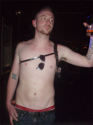
He is suffering from an unfortunate sickness that I like to call "Hipster's Trouser". It is what happens when subcultures collide. He is not wearing ultra-baggy homie jeans, yet he thinks it is cool to reveal two inches of underpant. I've remarked many a time on the black-stovepipe-denim-wearers at St Jerome's whose belts are mysteriously no help at all. Sometimes their waistbands even slip below the arse and sit underneath it. And from the back, it looks as though they've had an arse amputation.
And here's a picture of it from the front, where often it looks like only the penis is keeping the pants ahoist. Look at the guy on the right holding the camera.


But that still doesn't account for the question on everyone's lips, which is, "WHY WHY WHY?" It's easy to answer, "Does something as dumb as this even need an explanation?" There's a tendency to paint the wearers of these jeans as hapless fashion victims, although there's been much more criticism of women's low-riding jeans than men's. Here's just a taste:

Yup, as the Melbourne Fashion Festival comes to a close and the city whips itself into a lather over the usual catwalk parade of ridiculous, absurd and impractical clothes, it's clear Melburnians are paying no attention whatsoever. [...] I don't see a great deal of style around. I see the vulgarity of fashion that has left young Melburnians taking on a look that is shabby, slovenly and somewhat whorish. [...] chances are many girls and guys will continue to buy clothes that emphasise the huge gap between what they think they look like and what they actually look like.

But if we look at these sad, saggy creatures and consign their "bad taste" style decisions to Dick Hebdige's "place beyond analysis", we're doing what a familiar genre of style commentarydoes. We're not only creating arbitrary categories of 'good' and 'bad' taste; we're also creating a bogeyman of 'bad taste' -- saying that it doesn't follow the same embodied, pragmatic and affective processes that 'good taste' does. That it can only be observed with farcical incredulity and that people with 'bad taste' are fundamentally retarded in some way because they aren't ashamed of the way they look.

Sure, it's immensely fun and satisfying to be on the side of 'reason' in this fashion discourse. But I think it's important to ask why people wear their pants in this way. Because enough people do it to make the question relevant and interesting.

Of course, you also run the risk of being an Academic Wanker -- the rather hysterical sort who attributes improbable discursive significance to trashy or banal pop-cultural texts and practices, and equally improbable motivations to the audiences of and participants in these texts and practices. (Let it also be said that I decry the lazy journalistic practice of claiming all popular cultural studies is done by Academic Wankers.)

But let's forge ahead nonetheless. For me, this fashion is about the eroticisation of a certain kind of boyish male body. (Let's all pause a minute to thank MySpace for putting pictures of half-naked hipsters at the disposal of my completely detached analysis.)


See how low even the underpants sit? It's about the creation of a particular silhouette with a long body, narrow hips and slim legs. It says the wearer is not only skinny enough to wear such clothes; he's also so skinny they won't sit in place. And it's about a certain kind of preening body consciousness: you're always having to tug up your pants, thus drawing attention to your arse, hips and groin. But its artless slovenliness means it escapes being read as self-conscious, homosexual 'to-be-looked-at-ness'.

I'm not saying this is what the wearers of Hipster's Trouser consider while getting dressed every day. It's my gesture towards re-inserting meaning into a style that many commentators would say is just plain silly.