Sunday, February 21, 2010

Museum peregrinations: Silhouette and mannequins

The National Gallery of Victoria exhibition Drape features a Versace evening frock from 1996 posed next to a 1913 evening gown in the style of Paul Poiret's Directoire Revival. Viewers were meant to remark on the ways in which designers separated by decades have interpreted the ancient Greek chiton; but what I found more remarkable were the mannequins on which the dresses were displayed.


The Versace mannequin is noticeably taller, more statuesque and angular than the one displaying the Schmoiret, which is petite, with sloping shoulders and a swelling bosom. The 'contemporary' mannequin has a figure sculpted by diet and exercise, whereas the 'historical' mannequin's figure is sculpted by corsetry.

The catalogue entry for this garment noted that its innovation was to evoke an uncorseted figure while actually requiring a corset. The 1910s were a transitional period in silhouette, as the voluptuous, tightly corseted 'Gibson Girl' with her 'S-bend' figure gave way to the svelte, boyish 'flapper'. As well as Poiret, designers including Lucile (Lucy, Lady Duff Gordon) and Madeleine Vionnet were favouring less restrictive corsetry and a more naturalistic silhouette.

(As an aside, I really want to get my hands on a copy of Waist Not: The Migration Of The Waist 1800-1960 by Richard Martin. But I baulk at the price of international shipping.)

Meanwhile, the bias cut is often championed as flattering to the female body, but the Versace dress looks cruelly revealing: see how the pubescent, pointy breasts and hipbones jut through the dress, and even the stylised fat pad on the mannequin's stomach is visible. It reminds me of one of the 'origin stories' of the bra: improvised by New York socialite Mary Phelps Jacob, who in 1910 had bought a diaphanous evening gown but found it revealed her corset's whalebones.

At the Fashion and Textile Gallery in Sydney, Dreaming Of Dior author and curator Charlotte Smith told me that she prefers modern mannequins for displaying much of the Darnell Collection because these mannequins are quite slim, which suits the clothes. I should add here that Smith – the former wearer of some of these garments – is a tiny, birdlike woman.

A group of older dresses from the Darnell Collection (including the bustle dresses from 1884 and 1885, below, and a 1910 evening dress) are actually posed on child-sized mannequins with padded busts, hips and replica bustles. (Smith has the real period undergarments, but they're too fragile to use under the dresses. Besides, I think it's a shame to hide them that way.)


These images don't give the best idea of how small these garments are, but they are clearly clothes for adult women, so perhaps they do convey how weird it felt to imagine the bra-wearing kiddie mannequins beneath.

Smith's take on the small size is that women in the 19th century weren't as active and athletic as women nowadays, and also that people then tended to settle in the same areas where they'd grown up, so they lacked the 'hybrid vigour' of intermarriage that would result in taller offspring.

I'm still skeptical that either of these ideas completely explains the radical smallness of old clothes, but I am getting a sense for the ways in which any genealogy of clothing size depends on a concomitant genealogy of silhouette… and corsetry. The NGV measures its garments by "centre back length" and "waist, flat", which sometimes gives an indication of fit but sometimes doesn't. For instance, the Versace dress has a waist measurement of 32.5cm, whereas a gold lamé dress by Vionnet, c1927, has a waist measurement of 61.4cm. This doesn't mean the Vionnet was made for a larger woman, but rather that 1920s dresses had no structured waist.

While it's useful to think about mannequins in this case because they are judiciously chosen to show off particular garments in a 'museum-appropriate' way, it's a mistake to extrapolate that the sizes and shapes of retail mannequins reveal very much about the size and fit of clothing. Not only are the mannequins themselves abstracted for visual impact, but the clothing can also be carefully pinned by visual merchandisers, in the back where customers won't see it.

Years ago I wrote a feature on mannequins for The Age. It was originally commissioned by Sunday Life, whose then editor wanted me to write, basically, "Oooh, look, mannequins are getting larger to reflect 'real women'." This wasn't the picture I got from my own observations, nor from interviewing a mannequin maker. Also, I think Sunday Life was a little freaked out that I brought RealDolls into it. So they spiked it, but I sold it to the regular paper instead (albeit without the RealDoll stuff).

However, another bit of my research that never ended up making it into the final article was an interview I did with Daisy Veitch of Sharp Dummies in Adelaide. They are a really fascinating firm because they don't make retail display mannequins; rather, their dummies are meant to be used during the manufacturing process.

They've harvested extensive anthropometric data and used it to build human forms that don't just reflect the shapes of actual bodies, but are also specially padded so that their 'flesh' has the same 'give' as a person's. This makes them invaluable when fitting things like lingerie and jeans, where it's important that the clothing doesn't dig in. Rather than use a (live) house model, your company could buy one of these dummies.

I wonder if I still have the interview transcript somewhere. I'd actually love to interview Daisy again because anthropometric research is deeply implicated in clothing sizing; the world's first anthropometric study was done in Sydney for Berlei in 1926-27, and still forms the basis of Australian clothing sizes.

Saturday, February 06, 2010

The hunt begins

Today I was on Chapel Street in Prahran, battling the breeze that was lifting my skirt in an agonisingly embarrassing Marilyn Monroe way, and I couldn't resist ducking into the Chapel St Bazaar.

For those not familiar with this Aladdin's cave of retro ephemera, there are 70 stalls covering everything from clothing and jewellery to furniture, homewares and knick-knacks. It's bewildering and you can spend hours in there. I managed to make my way to a dead end where there was a small vintage fashion boutique. I think the name on all the labels was "Anna's", but Googling just now hasn't yielded anything much.

Anyway, I found myself looking at a certain rack where all the sizes seemed to be quite large: 44, 46 and so on. Some of these dresses were actually quite nice and I got quite excited imagining that I might actually fit into them. My only familiarity with European sizing is in lingerie, where I know that a 32 is a 10, a 34 is a 12, a 36 is a 14 and then I've never seen any European bras larger than that.

So I got into conversation with the staffer, who told me these are indeed European sizes, but that in general, sizes in the '60s, '70s and even '80s were smaller compared to their contemporary equivalents. She reckoned that a 40 would be equivalent to today's size 10-12, a 42 to a size 12-14 and a 44 to a 14-16.

I have tried to do some research online and have got a lot of contradictory information:
  • European sizes are pretty much adding 30 to a US size. Factoring in that US sizes are generally a size down from UK/Australian sizes, an Australian would add 28 to her regular size. eg 10=38.
  • Vintage sizes are five sizes smaller than today's.
  • Italian sizes are larger than French sizes, which are larger than English sizes.
  • Fifty years ago in the UK, if a garment was made for a 36-inch bust it was called a "36", and in the mid-'60s a garment sizing review led to "British Standard Sizing" – the 10, 12, 14 system.
Pauline Weston Thomas of Fashion-Era.com has more interesting stuff to say about sizing:

"Women were much slimmer in the 1950s or in earlier periods than now. You would never have seen a larger woman exposing her flesh 50 years ago in the way that an overweight teen girl might show her belly button stud in hipsters today with fat plunging over it. If you were fatter than the ideal you covered the fat up in alternative styles of a tent like or straight down shift like sack dress.

"One reason for trying to keep the weight down was quite simply that it was very difficult to buy any fashionable garment over a size UK 14 in the main fashion shops and even then they were cut very skimpily. Some ranges did go up to a UK 16, but only very occasionally up to an 18. If they went up to a UK 18 they probably had lost the fashion edge.

"An important factor with sizing is the physique. No one really pumped iron in the UK until late 70s. Going to the gym to workout was not usual. It was harder to put on weight from snack food then as Pizza was available in about one place in central London as I recall. The main snack bar of the era nationwide was Wimpy. A curry or steak on a Saturday night was the norm rather than deep fried snack food and the portion size even of a wimpy was much smaller. Also central heating was getting better, but still not everywhere, so people burned off more fat and walked more after an evening out. Taxis were only just taking off in the UK provinces for a night out."

And then this:

"Sizes were cut smaller then too and so a vintage 12 is not the same as a UK or USA or European Community 12 of 2003. Today buyers list sizes as plus sizes or queen size if they measure larger. If 50s they probably have labels like extra extra outsize inside them. For the same reason of lack of fashion variety women in the plus range either made their own clothes or had them hand crafted or custom made. Corsetry was popular for this reason alone and no women went without a girdle."
I have had a shameful thought, too: my favourite aunt, my mother's sister, has worn plus-size clothing her entire life – there are heartbreaking family photos of her standing sullenly in her '60s shift and pillbox hat at her brother's wedding while my much slimmer mother poses like a model. I wonder if she would agree to be interviewed by me.

It's a shameful thought because I haven't seen or spoken to her for a few years (she lives in Brisbane), and so it is kind of insulting that my opening salvo is, "Hey, can I interview you about being fat in the '60s?"

Tuesday, January 19, 2010

What fat chicks used to wear

It's interesting (to me, at least) that this blog has gone through phases. When I began Footpath Zeitgeist I was fascinated with ideas of glamour, luxury and hip-hop aesthetics. Then I became obsessed with hipsterism and related ideas of singularity, customisation, nostalgia and irony. I've also been intrigued by market diffusion and style education: how and where we learn what to wear, especially in the retail space.

But one thing you may not have picked up – because I haven't written about it nearly as much as I've thought about it – is that over the last year or so I've become increasingly obsessed with the aesthetics of the past and I've dipped my toes into the fraught subcultural industries of 'vintage'.

I call them fraught because I don't stake significant parts of my selfhood on nostalgic subcultural practices such as swing/rock'n'roll dancing, mod/northern soul, twee/Britpop, rockabilly or collecting modernist furnishings. Yet – and I associate this largely with the popularity of Mad Men – I've really started to like old-fashioned stuff. And I fret that I'm not doing it right, and hence look stupid in front of people for whom these are key aspects of their identities.

I'm frustrated at having been so busy with other writing last year – especially for my online magazine The Enthusiast – that writing here became a luxury of time that I felt I just couldn't afford. I never got around to that post I wanted to write about petticoats, for instance. Perhaps I will soon.

However, one topic I definitely want to turn to this year on this blog is an investigation into historical dress and the vintage clothing market that I have been calling What Fat Chicks Used To Wear. I began to ponder this question when thinking about how I just don't even bother trying on dresses in vintage stores, because I know they never fit me. Whenever I visit an exhibit of historical garments, I never fail to marvel at how small they are. And Hollywood actresses are invariably bird-thin, regardless of the body shapes in vogue during the historical periods they portray.

Of course, people's bodies in general have become taller and larger as health and nutrition improve in the West, and we are getting fatter because of calorie-laden convenience foods and more sedentary lifestyles. But there have always been a wide range of human shapes and sizes, so what has become of the clothes these people used to wear?

Wasn't fat formerly prized as a marker of youth and fertility (because fat people could survive and reproduce) and of wealth and power, because only the aristocracy could afford to delegate physical labour to others and eat rich foods? Have the clothes of historical boombaladas been lost? And there were certainly fat people buying clothes in the prosperous mid-century decades so beloved of vintage clothing dealers?

Basically, I'd like to sketch a cultural history of clothing fit and sizing, and the ways in which we – metaphorically and literally – squeeze our unruly bodies into various socially determined moulds. However, I have to say I'm not especially interested in contributing to the repetitive debates about size zero, the rise of vanity sizing, the weird pitting of plus-size models against regular models and the use of sizing as a strategy of brand exclusivity. Nor am I interested in "positive body image", magazine portrayal and manipulation of body shape and size, the contemporary plus-size market or why it's so hard for fat chicks to find nice clothes in the shops.

Instead, I'd like to investigate several different problems:

What are the semiotics of clothing fit? I wonder if anyone has really investigated this before: the impressions we form of people based on the way their bodies fill their clothes. I'd like to trace this through pop culture. Here I'm thinking about stuff like hip-hop notions of 'bigness' and 'littleness', high pants versus low pants, Cinderella and her stepsisters squeezing into that shoe, and the discomfiting vocabulary of 'muffin tops' and 'cameltoes'.

When and why did clothing size become standardised? Was this a product of prêt-à-porter, when clothes were no longer tailored for individuals but produced and sold anonymously, yet somehow still had to look good on a variety of body shapes and sizes? Was it a function of the rise of different retailing models such as mail-order catalogues and department stores? Does it have to do with sumptuary laws and embourgeoisement?

How were clothes fitted in the pre-standard sizing era? Here I could investigate the ways in which tailoring and fit became important aesthetic considerations in particular historical eras. I'd love to visit the Drape exhibition at the NGV and think about the ways in which the looseness and tightness of fabric has historically revealed and concealed the human body. Perhaps what we would consider an ill-fitting garment would have been thought very elegant to people of different eras.

What methodologies have been used to delineate clothing sizes? I did some basic research by Googling for "plus-size vintage", and via some shopping tips, I learned that in the past, plus-size clothes were labelled as "half-sizes" or marked "sized to fit". I'd like to find out how clothing sizing has been organised in different countries and where the numbering systems came from.

Which ancillary industries rely on garment fit?
Here I'd look at the clothing alteration industry, the lingerie fitting industry and other associated industries and professional knowledges about how garments ought to fit.

How does clothing pass into the archival and the vintage market?
What's behind the narrow size range we see in museums and vintage stores? Could it be that only certain sizes of garments tend to survive? Does it have to do with the ways in which garments were handed from wearer to wearer, bought and sold second-hand or hoarded by their original owners years after they ceased to fit them? Where are vintage clothes bought by dealers and conservators, and what do they look for?

Wednesday, October 28, 2009

Amateur hour

I have no training in garment design or patternmaking, but some idiotic impulse in me fills me with the confidence that, when it comes to it, I can totally make my own clothes without using patterns. Sometimes this works really well. Most of the time it works okay. Sometimes, I fail miserably.

Of course, things would be much easier for me if I simply bought a dress pattern. But for some reason this seems much more difficult to me than quickly cutting and resewing sleeves and hems, or pinning a garment on me and then resewing it. Also, I use clothes I already own as templates, modifying the lines to suit what I'm making.

My biggest triumph in this way was probably my Collingwood Boxing Club T-shirt, which was an enormous baggy thing I bought from Savers. I unpicked the sleeves, recut them and the body to match the shape of a T-shirt of mine whose fit I liked, and then sewed them back together.


Oh god, my hair looks like Bret Michaels or something. That pic was from early in 2005.

I also made a dress to wear to my undergraduate valedictory dinner. It was long and bias-cut with spaghetti straps and a cowl neckline; I remember that I made it by laying the fabric on the floor and placing a dress of roughly the same length and shape over the top at a 45-degree angle to act as the template. I made the cowl neck by allowing a generous semicircle of fabric at the top of the dress, which then hung loosely inside the neckline.

There was also my Donatella Versace costume, which I made for my 26th birthday party (the theme was "More dollars than sense"). It was beyond my limited abilities to make a Versace evening dress (like this one Donatella is wearing, left; Saturday Night Live comedian Maya Rudolph is at right), but I wanted to look a bit fancy, so I found an apricot-coloured satin slip/nightgown and an apricot-and-bronze patterned chiffon scarf in an op-shop.

I cut the neckline very low and added a border of the chiffon scarf material, which continued as shoulder straps that fastened in the back. I also cut out triangular panels in the nightgown over the ribs and under the bust and filled them in with panels of the scarf material. It was a real challenge to match the bias cut of the dress with the replacement fabric. I cut a big slit in the skirt over one thigh, and made the skirt longer by adding an edging of the chiffon.


At the party I wore the dress with my skin painted nugget brown and a long white wig. I later wore the dress for an Incredible Melk photo shoot. You can see my hand protectively on my boob to stop it falling out of the dress.

I also don't own a sewing machine or a dressmaker's dummy, so all these things are sewn by hand and I adjust the garment as I am wearing it in front of a mirror.

This week I am attempting another ambitious dressmaking project. It's doubly ambitious because it's an attempt to rescue a failed dressmaking project from last July, when I tried to make a '70s-style 'Grecian goddess' prom dress from some vintage hot-pink gauzy fabric I found at Savers. It's some synthetic fabric – rayon, probably.

It was meant to come out looking similar to this:


But I really screwed up because this was the first time I had attempted to make a dress from scratch without a pattern. I can't quite explain it, but I had imagined very clearly how the dress was going to come together. I could picture the dress in 3D and mentally turn the image around as if it were a Rubik's cube, imagining how I would need to cut and pin and drape the fabric to create this image.

Anyway, I was very rushed and tired and it got to 3am on the night before the prom. I had the dress pinned on me and I was cutting it at the same time, but I accidentally cut it on an angle rather than straight, totally ruining the dress.

But I have decided to attempt to turn it into a '60s-style cocktail dress. Here is a crappy diagram of the way I would like the dress to look. I have drawn the skirt too short; it sits just below the knee.


I have cut out the pieces of the bodice, which looks the same in front and behind. The band goes around the ribs and the skirt begins at the true waist. It is gathered finely at the shoulder, bust and waist – doing this by hand will be the tricky part. Because of the semi-sheer fabric I have allowed two layers in the bodice.

At this stage I'm thinking I'll begin by gathering the shoulder pieces, then sewing the front and back pieces together at the shoulders. Then I will pin the band in place on me and tack it in the front so it sits properly. Once I've put the bodice together I'll attach the skirt. I think there's enough fabric from the old prom dress for more layers in the skirt; I'm thinking about creating a 'self-petticoat' edged in tulle to make the skirt stick out. Then I'll add a side zip.

Time will tell if this project is a success or an abject failure.

Thursday, September 10, 2009

The look of comfort

What follows was commissioned by The Age back in June, but due to a series of comical misunderstandings it was never published. Not to let my work go to waste, please enjoy it here.

Cruel winter is a time to dress for comfort. Fleecy tracksuits, layers of cotton jersey, shapeless jumpers and cardigans, fluffy socks, flannel shirts, slip-on shoes, and even this season’s key piece – a fleecy blanket with sleeves.

As a keen proponent of the notion of “No Pants Friday”, I can attest that baggy tops and tunic dresses worn with leggings are some of the cosiest winter outfits around. I write this while wearing harem pants.

Problem is, comfort and fashion don’t often coincide. Vitriolic condemnations are proffered at Leggingsarenotpants.wordpress.com and Tightsarenotpants.com. Lindsay Lohan’s well-documented love of leggings is often considered one of the American actress’s personal troubles, along with her controlling parents and drug abuse.

Harem pants have also endured a backlash, especially in their current drop-crotch incarnation. Some say they distort the body’s natural proportions. Others ridicule harem pant-wearers for resembling MC Hammer, a penguin, or a baby with a full nappy.

Indeed, dressing for comfort is generally considered the antithesis of caring about your appearance. People are quick to condemn comfy clothes as ugly, slovenly, and even warning signs of mental distress.

For some reason, comfortable shoes especially enrage fashionistas. Crocs have become the shoe people love to hate, ousting Ugg boots, Birkenstocks, hiking sandals, massage sandals, sheepskin moccasins and those dove-grey vinyl shoes with zippers. The Facebook group I Don’t Care How Comfortable Crocs Are, You Look Like A Dumbass has close to 1.5 million members.

I must admit to a feeling of dumbass-ness as I clomped around in a pair of black suede, Velcro-fastened ankle boots by sensible German brand Ara. They had been given to me by my mother, for whom they were slightly too small. “I know you’ll think they’re ugly,” she’d presciently told me.

But the true ugliness of these shoes wasn’t their actual appearance, but the way they made me seem like someone who doesn’t care how she looks. No amount of physical comfort, it seemed, could offset this social discomfort.

But by calling comfortable clothes “ugly”, we reveal that they don’t operate in a separate sphere from fashion where aesthetic considerations don’t matter. Instead, fashion’s denigration of comfort reveals its own high stakes.

The fashion world has always defined style as something ineffable and difficult to acquire. Learning this sensibility is a mental discipline and fashionable clothes themselves are a bodily discipline. Difficult-to-wear things such as teetering high heels, stiff tailoring and corsetry are mimetic symbols of the effort and sacrifice it takes to be chic.

Many criticisms of comfortable clothes also carry socio-economic inflections. Moccasins and flannelette shirts are deemed bogan uniforms; outer-suburban mums are fashion criminals in leggings and baggy windcheaters; silky tracksuits by Kappa and Adidas are “woggy”.

Wearers of Birkenstocks and Crocs (themselves derived from peasants’ clogs) are mocked for being pretentious bourgies, while we sneer at nouveau riche celebrities for their Juicy Couture velour tracksuits and Ugg boots.

However, one of fashion’s most iconic names made her reputation by turning devalued symbols of class into statements of luxury. I’m talking, of course, about Coco Chanel.

As dramatised in the current film Coco Avant Chanel, Gabrielle Chanel came from humble, provincial origins and made her own clothes by adapting men’s sportswear. French fishermen’s everyday clothes inspired her high-fashion silhouettes, and she created glamorous, feminine garments in cotton jersey, which had formerly been viewed as a cheap fabric for men’s undies.

Disdaining the Belle Epoque’s corseted waistlines, fussy ornaments and enormous, feather-filled hats, Chanel found new elegance in simplicity and freedom to move.

With layers of padding and interfacing, Dior’s traditionally tailored New Look garments were incredibly heavy and sometimes needed help to put on. By contrast, Chanel’s famous tweed jackets were made by simply sewing the lining to the outer shell, and were as light and comfortable as cardigans.

“Luxury must be comfortable, otherwise it is not luxury,” opined Chanel. And while I wouldn’t claim she inspired the Snuggie, it’s true that luxurious things are those purely intended to give pleasure. There are definitely tactile delights in swathing our bodies in soft flannel and fluffy angora – and even much-maligned fabrics such as polar-fleece and Tencel are designed to be pleasant to touch.

Dressing for comfort doesn’t mean giving up on looking good, either – it has visual pleasures. Soft fabrics fall into exciting, sculptural folds. Bias-cut garments skim the body gracefully, creating fluid waves as the wearer moves. Loose garments skim flatteringly over pudgy or gaunt figures.

Sorry Mum – nothing is going to make those German walking boots stylish. But funnily enough, the main reason I’m not wearing them is because they’re cut awkwardly just above the ankle and dig into my legs as I walk. They’re simply not comfortable.

Sunday, July 26, 2009

Design journalism


About a week ago I was commissioned to write a 1000-word feature on 'capsule collections' that are joint ventures between fashion labels and retailers. The story was for Design Reporter, an initiative of the 2009 State Of Design festival that was independently produced by Chase & Galley and edited by Penny Modra and Ray Edgar. (The astute observer will realise that I worked with Stuart and Penny on Is Not Magazine.)

It's really a magazine, with news, features, interviews and reviews about different aspects of design and debates within the field, but it uses the newspaper format to provoke questions about what we currently settle for in design writing and journalism in general. I haven't actually got my hands on a copy yet, so I can't tell if it's achieved its ambitions, but I'm amused by the way the front page makes design topics – which are so often arcane and elitist – seem like urgent news for everyone.

As you can see, my story ended up with the tiniest headline on the front page (it appears just above the giant EAMO'S), which may be a good thing as I worked really hard on it but wasn't especially happy with the results. Within the word limit, I pretty much just had space to give a broad overview of some of the best-known designer/retailer collaborations, gesture towards the way they were viewed by designers, retailers and consumers, and suggest some criteria for a 'successful' collaboration.

I feel frustrated that I didn't really get to the bottom of why these collaborations are everywhere right now, and what's at stake for everyone involved. I can't help thinking that if I'd had more time to think about and shape the piece, more incisive ideas would have emerged. Lately I have been thinking that the way I write often feels like the process of hewing a statue from a hunk of marble – revealing and polishing ideas using words as my tools. The more I chip away with my writing, the more I feel the essence of what I'm trying to say emerges in a recognisable, elegant form.

However, this isn't really compatible with the 'reportage' approach that was important for the Design Reporter project. I felt as if my final story had been a compromise between an interview-driven story and an analysis-driven story, without the strengths of either genre. Also, having to depend on interview material to shape the story was logistically difficult. As well as Fat, I had approached TV, Alpha 60, Alice Euphemia and Chip Chop! for interviews, but only Bianca Wiegard from Fat and Karen Reischieck from Alice Euphemia were able to respond by my deadline. I felt bad about not including Karen in the story but then I didn't want to turn it into a story about how independent boutique owners view mainstream design collaborations.

Anyway, these are just a few thoughts on the constraints and compromises involved in the production of this particular story.

The Beautiful And The Damned


Zac Posen For Target: A replica of the Posen evening dress Katherine Heigl wore to the 2007 Emmy Awards. Only 50 of these dresses were made for Target, retailing at $299.99.

When fashion designers – or fashionable celebrities – “collaborate” with retail chains, it raises intriguing questions about the value we place on “designer clothes”. Just as the movie industry has invested heavily in logics of auteurism, so fashion’s fulcrum is the notion of a single creative vision, distilled in the ‘label’ and personified by the ‘designer’.

These collaborations owe their frisson to the presence of a famous name in a mundane retail environment where it usually doesn’t belong. Linking themselves with labels and designers adds a certain gloss to downmarket retailers.

In return, designers get to grow their brand without having to use their own logistical and marketing resources. The bargain is especially tempting for emerging designers.

Some collaborations operate more like designer diffusion lines exclusive to one retailer. There’s Ksubi’s Alba Fan Club, sold only at Jeans West, and in August, Sportsgirl will spin off The Beautiful And Damned from jeans label 18th Amendment.

“Sportsgirl were interested in us creating a one-off style for them and we thought we would go one step better by designing an entirely new brand,” designer Rachel Rose recently told Vogue Australia.

However, collaborations also tend to suffer from a perception of inferior workmanship and dull styling. They can cheapen a designer’s brand and erode its value to smaller boutiques that pride themselves on unearthing new talent and stocking ‘directional’ merchandise.

With new collaborations constantly entering the marketplace, it’s hard to remember the genuine excitement in 2004 when Swedish chain H&M announced it was working with Karl Lagerfeld. Could a couture designer adapt his creative vision to the tyrannies of the fast-fashion marketplace?

Turns out he could – Lagerfeld’s range sold out within hours, and H&M went on to collaborate with Stella McCartney, Viktor & Rolf, Jimmy Choo, Roberto Cavalli and Comme Des Garçons. Celebrities designing H&M ranges have included Madonna and Kylie Minogue, but the best-known celebrity collaboration is Kate Moss for Topshop, in May 2007.

In January 2006, Target in the United States launched its Go International house brand, which has featured Proenza Schouler, Alexander McQueen and Thakoon Panichgul. US Target has no corporate relationship with the Australian chain of the same name, whose first designer collaboration came in October 2006 with a range by Alice McCall.

Recently, proudly fat singer Beth Ditto’s collection for British plus-size chain Evans has generated some old-school, Lagerfeld-style buzz. The contrast with Lagerfeld is delicious, considering that the once-obese German had railed against H&M’s decision to sell his designs across their full size range. “What I designed was fashion for slender and slim people,” he harrumphed to German magazine Stern.

Lagerfeld swore he’d never do a collab again, also complaining H&M had deliberately made too few garments. “I find it embarrassing that H&M let down so many people,” he said. “I don't think that is very kind, especially for people in small towns and countries in eastern Europe. It is snobbery created by anti-snobbery.”

Meanwhile, the Designers For Target label earned notoriety in March 2007 for the frenzied consumer response to its Stella McCartney collection. Spurred on by the novelty of international designer merchandise in a discount department store, shoppers splurged on huge and random armfuls of clothing, most of which ended up glutting eBay and being returned sheepishly to Target stores.

These are the tensions that plague collaborative ventures: exclusivity versus availability; the ordinary versus the special; a designer’s vision versus consumers’ tastes.

“I’m in two minds – I’m yet to decide whether it’s good or bad,” says Bianca Wiegard, director of Fat boutiques. “From our perspective, as a boutique, cutting-edge retailer, it dilutes the brand for us. What these [designers] are doing, essentially, is selling the same collections that they’re selling to boutiques like us, but with cheaper fabrics.

“But obviously it gives designers the opportunity to get a huge injection of cash,” Wiegard continues. “These big companies come along and they’re obviously targeting businesses like ours, so they’ll see who are the up-and-coming designers and then they’ll offer them cash upfront. A lot of the designers would never have seen that much money.”

Wiegard’s colleague Ben Esakoff adds: “In this market, designers need opportunities, because it’s tiny. For them it’s that fine line between doing something really commercial and selling themselves out to their core market.”

Esakoff wagers that smaller retailers might actually benefit from the collaboration phenomenon. “It’s a different demographic to us at the cheaper end, but creating a cheaper brand makes it more aspirational, which is beneficial for us,” he says. “The only thing that’s bad for us is if the brand is overexposed.”

It also doesn’t pay to underestimate consumers, who’ve become much less willing to be seduced on the promise of celebrity alone. They’re no longer the star-dazzled dupes who filled trolleys with Stella McCartney clothes – indeed, proudly parading around in clothes identifiably from collaborative ranges carries a “Stella stigma”, a whiff of fashion illiteracy.

To succeed these days, collaborative collections must seem like meteorites landing, bright and hot, in a paddock. They’re only exciting if they arrive, fully realised, from somewhere else mysterious and inaccessible, and if they look radically different to everything else in that paddock.

A major criticism of Romance Was Born for Sportsgirl and Josh Goot for Target was that both labels replicated designs from their existing collections. Other collections, such as TV for Sportsgirl, Chip Chop! for Sportsgirl and Zac Posen for Target, disappointed blog commenters and fashion forum users who deemed them “bland” and “boring”.

Without that alien allure, more pragmatic considerations come into play… like uniqueness, price and wearability. “Wearable” is somewhat of a fashion industry euphemism for “unimaginative design”, but from the consumer’s perspective, it’s about quality fabrics and tailoring that make a garment look good when worn. For this reason, Yeojin Bae’s Target collection got a big thumbs-up from fashionistas.

No amount of hype about the designer will save garments that are deemed “overpriced” or “cheap-looking”. The clothes will hang forlornly in the stores forever, getting ignominiously cheaper and cheaper.

“I actually bought the Gail Sorronda black denim skirt today for $4.86, because I needed something to paint my house in,” gloated one Vogue Forums user.

The notion of ‘designer-ness’ alone won’t dazzle shoppers into buying anything. But there’s definitely a certain magic when designer/retailer collaborations yield something genuinely original.

This article first appeared in Design Reporter.

Saturday, May 09, 2009

Further thoughts on colour

Since I first posted about my resolution to dress for colour this winter, I have realised just how little colourful clothing I own. I really don't have enough to do top-to-toe layering in more than a few colours. Reds, pinks, purples and blues, mainly – dressing for colour is a great way of getting a fresh perspective on your wardrobe.

Sadly for my wallet, dressing for colour has also been an excuse to buy colourful new clothes. I have been getting a lot of wear out of a bright apple-green cardigan that I got from a cheap-shop, and I went to Cotton On, where I purchased a large red patterned scarf, a magenta scarf in T-shirt material (purely so I would have something to match with my new harem pants), a pair of turquoise leggings and two men's T-shirts in sky-blue and red (on special for $5 each).

It's interesting that I had to raid the men's department to find bright colours in winter. I'm quite shocked at how few colourful clothes are in shops right now. I can walk into a shop and from its entire winter range, I can pick out only three or four garments colourful enough to interest me. Even tights this year are in muted colours, and the availability of brightly coloured opaques is usually something you can count on in winter. On the flipside, this is a wonderfully economical way to shop.

This experiment has made me realise how cruelly my dress sense was previously governed by silhouette. I used to choose outfits based on how they draped, revealed and concealed my body. However, the new regime of colour is much looser and more layered, far less neat and preppy than what I would wear in the past. Yet I don't feel sloppy or frumpy; the bright colours make the outfit look carefully assembled.

I'm also finding I'm far more adventurous with contrasting and clashing colour combinations, such as red and purple, orange and pink, and yellow and blue. However, as I think I may have written on this blog before, I just can't bring myself to wear green and red (too Christmassy), yellow and green (too Aussie) and blue and red (too much like Superman).

Another thing I've decided to do is to layer clashing prints as well. So I'll have polka dots with checks with florals with stripes with geometric prints, but all in the same colour family so they blend together. Or I'll layer several different-coloured versions of the same print: maybe a striped dress with a differently striped top underneath. I really liked this look from the Sartorialist's recent trip to Australia (although I must say his coverage of Melbourne was really pitiful – why do we persist in giving overseas visitors the misleading impression that Chapel Street is Melbourne's fashion hub?).


Here is a bizarre photo montage of my outfit from yesterday. I was very uneasy with it at first, but then as the day wore on I got happier and happier. By the time I was walking down a drizzly Swanston Street at 11:30pm, surrounded by people wearing dull black, grey and other wintry colours, I felt wonderful, like a peacock. I didn't care whether I looked ridiculous or not.


This is my outfit today. You can see my recent acquisitions, the apple-green cardigan and the blue T-shirt, and I realised that the necklace was the same colour as the T-shirt. There's a history to the scarf: my mother made it for me only recently from some remnant fabric she found while cleaning out a cupboard.

It's a dark turquoise microfibre (it came up lighter in the photo) that I picked out in 1993 for a dress my mother made me to wear to my year 10 school 'semi-formal' dance. My friends and I ended up getting extremely drunk before the semi-formal and then were horribly, publicly sick at the event itself. The next day, my dad took my dress to the dry-cleaner where he met my school vice-principal, who was getting her own dress dry-cleaned.

The dress was never the same after the dry-cleaning, I have to say. I wore it only once more, as an in-joke, to my year 12 valedictory dinner, and I have long since fattened out of it. But the scarf is a fun reminder of the whole debacle.

The sharif don't like it

Almost a month ago I was in Supré, "just to see what they had", and I came away with three new garments: a pair of red tartan leggings, a pair of black harem pants, and a pair of what can only be described as magenta three-quarter-length MC Hammer pants.


They also had them in violet and in black. I don't know why I bought the magenta ones, because as I've mentioned, magenta is one of those colours that looks wonderful and vibrant in the shop, but that I find really difficult to match to the rest of my clothes and accessories.

The label described the magenta pants as having a 'drop crotch'. Reader, this was not true. The 'rise' of the pants (the space between the waistband and the crotch) was actually smaller than the average pair of pants, and if not worn very low on the hips, they were horribly tight and bunchy in the crotch. I actually undid the crotch seam and re-sewed it lower down to loosen up the pants.

2009 is definitely shaping up as The Year Of Drop-Crotch Pants. These have been hanging around (pardon my pun) since at least 2007, then Radar was sure they were heading mainstream in 2008, but it's only this year that mainstream fashion commentators have started talking about them and Australian designers have started including them in their collections. And, of course, they've trickled down to fast-fashion stores such as Supré.

These aren't so much your traditional harem pants that are voluminous all through the leg and then gather at the ankle. Rather, they're in cotton jersey material and are pleated or gathered at the waist or hip and voluminous to the knee, then tight or ruched to mid-calf or ankle.

Fashion Flux has an interesting 'pattern' for making your own – just get some stretch jersey fabric and use your favourite leggings as a template, but make the crotch lower and allow more material around the thighs. Livejournal user Moohoop went one better and converted an old windcheater into drop-crotch pants – an idea of such simple genius that I want to run to the op-shop right now to do the same.

Many observers seem to have a problem with drop crotch pants because they distort the body's 'natural' silhouette, making the legs look ridiculously short and the body too long – "like a penguin", was one response. Other people think they're unflattering on all but the tallest and thinnest body shapes. Others can't get over the '80s/'90s-ness of them – they are ashamed to look like MC Hammer. Some think it looks as though you've pooed your pants. And others think drop crotch pants just look badly designed or fitted, as though the wearer has borrowed someone else's clothes.

The counter-argument is "but they're so comfortable!" Especially because they're usually made from soft material that drapes nicely, drop crotch pants are kind of the fashion-forward version of tracksuit pants. They're also far more forgiving on the body than leggings – which are still being worn as pants, despite at least two bloggers' outrage. You don't need to worry about visible panty lines, cameltoe or polterwang. And the pants skim right over the wobbliest parts of your legs.

A related phenomenon is boyfriend jeans, so-called because they're so baggy and oversized they look borrowed from the man in the wearer's life. The way they're often worn with the cuffs turned up also reminds me of harem pants, because this tends to draw the jeans in at the ankles. Also, men's jeans tend to have longer rises and more room in the crotch, which, when worn by women, creates the drop-crotch effect.

These jeans, too, are about comfort – as well as the actual fit, they imply the comfortable domesticity of having a man about the house whose clothes you casually borrow. It's curious to think that in a way, boyfriend jeans are another kind of harem pants in that they suggest the wearer 'belongs' to a man, just as an odalisque or concubine belongs to the sultan. Could drop-crotch pants, with their radical de-emphasising of a woman's buttocks, crotch and thighs, be suggesting that the wearer isn't sexually available to the viewer – that she's already 'taken'?

Saturday, April 11, 2009

True colours

On Tuesday I bought a pair of harem pants (more on this later) in magenta. The pants were available in black, violet and magenta, and for some reason, magenta is one of those colours that I buy because it seems really striking when it's on the rack, but then I find it really difficult to work in with my other clothes when I get it home.

The same is true of some other colours I love. There's a blue that I call cornflower blue but (according to my computer monitor) is closer to Persian blue. I first bought this as a T-shirt, then another T-shirt that's orange with stripes of this blue, then I bought matching canvas ballet flats, and after a very drawn-out search for accessories in the same colour, I was very excited to find an Indian silk scarf in this blue in a $1 basket at Camberwell Market.

Another colour I'm obsessed with is a light orange-red (scarlet?). I first became obsessed with this colour in lipstick and nail polish, but I now own several T-shirts in various hues of it, plus several scarves. I own a lot of red clothing, but it varies between a 'true' medium red (stop sign red), a faded medium red, a blueish red and a rich ruby red.

Being from Melbourne I own a lot of black clothes – I now own five pairs of black pants, four black skirts, two black cardigans, four black jackets, three black dresses, and so many black tops that I have to pick them out by the feel of the fabric when I want to wear one in particular. Sometimes I get into hopeless rages because I can't find the particular black top I want, and I have to empty them all onto my bed to sort them out.

When I feel especially despondent about the way I look, I will wear black because it is easy to look 'put together' in an all-black outfit. But in shops, I prefer looking at colourful garments. Today I was in French Connection and I was drawn to a bold orange winter jacket with square buttons (they want $260 for it, tell 'em they're dreaming!) and some knitwear in oranges and apple-greens… purely because these things stood out from the boring blacks, greys and navies in the rest of the store.

So this winter I have decided to dress for colour rather than for silhouette or texture. Being a fat chick, I find dressing for silhouette quite dispiriting because I simply don't look good in many sculptural clothes: for instance, nipped-in waists with voluminous skirts, tops tucked into high-waisted pencil skirts, or form-fitted dresses with voluminous sleeves.

Dressing for texture I see as something ageing women do to show they're still 'in fashion' while wanting to de-emphasise their bodies. So they'll layer different textures with stuff like scrunched-up satin, embroidery, fringing and beading, knits of various gauges, and varying amounts of sheerness and opacity. Maybe I'm wrong about this being something that older women do, but I think it can be quite ageing on young people.


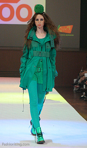
Fool, 2009 L'Oreal Melbourne Fashion Festival. Image: Fashionising.com


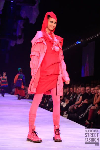
Fool, 2009 L'Oreal Melbourne Fashion Festival. Image: Melbourne Street Fashion

I was really inspired by Fool's collection at this year's Melbourne Fashion Festival. They brought out some models in very bright contrasting colours, with playfully oversized knit accessories. But my favourite outfits were the ones that layered different shades of the one colour. I think it looks really striking.

I was also really inspired by the outfits that Isla Fisher wears in Confessions Of A Shopaholic. I love the bright yellows, pinks and oranges she wears, and I especially love her colourful leather gloves.


So my strategy this year is to wear relatively soft and shapeless garments, but to layer different shades, or wear bold contrasting (or even clashing) colours. I even want to wear clashing prints, such as polka-dots with tartan or different florals together. I would try to make sure that there was a common colour in all the prints to hold the look together.

The risk you run with colour layering is that you look like a batty old lady. Here I always think of Linda Jaivin when she appeared on that old ABC arts panel show, Critical Mass, always with her red glasses and red accessories. I find it embarrassing when people have a 'signature colour' and that's all they ever wear.

The opposite risk is that you look matchy-matchy, which is my word for the sad result when you can tell someone has attempted to match the colours in different parts of their outfit but it looks very timid and fussy. For instance, the other day I saw a woman wearing a pink top, grey pants and pink shoes – but they were the wrong shade of pink. Her top was more like a salmon colour, whereas the shoes were fuschia. You could almost imagine her thought process while getting dressed that morning: "Yeah, I'll wear my pink shoes".

I used to mistake matchy-matchiness for elegance, but (largely after reading The Sartorialist) now I feel it's much more elegant to echo the colours of an outfit rather than attempt to match them precisely. You don't want to look as though you're in uniform: you want several small colour details to leap out at the eye.

Today I am wearing my fuschia Hammer pants with my cornflower blue T-shirt, scarf and shoes. I am wearing a black cardigan over the top but for once I don't feel it's too 'Melbourne' of me, as in this new way of thinking, the black is the highlight colour rather than the base colour.

Saturday, November 29, 2008

Lamb dressed as mutton

Today I picked up my new glasses. I haven't bought a new pair in years and years. The frames I desperately wanted looked like this:


They are by iconic American optical company Shuron. The model is called Ronsir, or as I first thought of them, "Malcolm X glasses". The style is known as browline after the heavy top half and lighter metal bottom half of the frame, but they're also colloquially known as "G-Man" glasses, I guess because they were hugely popular in the '50s and '60s, the period when lots of FBI-themed movies are set. Annoyingly, they're becoming more popular now that people are seeing the style on the TV show Mad Men.

Ray-Ban also makes a style of sunglasses like this called Clubman. Belinda Carlisle wears them in the video for 'Mad About You', which I've always thought was unbelievably cool. With her little black dress and voluminous bob haircut, she reminds me of an '80s version of Marilyn Monroe. Unlike the gimmicky stuff that most kids today think of as '80s, this video reminds me of what I longed to look like back then. I loved Wendy James from Transvision Vamp as well; I thought she was so glamorous and sexy.

The thing that I like most about this style is that it instantly makes me look cooler. I don't especially want to look ultra-hip, but I can't stand looking like a dorky laughing-stock either. I often agonise over this. One of the main shortcomings of my failed leather jacket is that, rather than make me look instantly twice as cool, it makes me look twice as dorky. Now I can only ever wear the leather jacket with some ridiculous hipster get-up, so that the dorkiness and the hipsterness cancel each other out and I represent a modest, acceptable amount of cool. Anyway, the point of these frames is that even a fairly drab outfit will instead look "minimalist", and a potentially frumpy one will look "eccentric".

Australian shops don't really stock browline glasses, and when they do, it's mind-bogglingly expensive. I went to Henderson Optical, where I was told that to get a similar frame from Japanese label Dita, with my lenses, would cost me about $800. For crying out loud! In the end I bought a pair of vintage Ronsirs from eBay a couple of weeks ago. Even with the terrible Aussie dollar exchange rate, the cost of postage and of getting my prescription lenses put in, they'll work out at about half the price.

But along the way I was tipped off about an optometrist in Clifton Hill that might have what I was looking for. Turned out they didn't, but they did have a very attentive (probably bored; I was the only customer in the store) sales assistant who didn't give up when I disliked most of the Sarah Palin-esque frames in the store. She went out the back to rummage in boxes of old and sample stock.

The older and uglier the frames she brought out, the more I liked them, and eventually I got very enthusiastic about a pair of pink plastic grandma frames that, the assistant informed me, she'd got from their "Veteran's Affairs box" - the super-cheap, ugly frames they keep for pensioners. All up, these glasses cost me $270, and I'll admit that it was the price that ultimately won me over.


Today I went and picked up the glasses, and so far I'm disappointed. I wanted some kind of reverse librarian effect: where instead of being told you're beautiful when you take the glasses off, you put them on and instantly your look comes together. However, I look like a bad babysitter who has murdered her young charges. Sorry about my dreadful posing, but this was actually the best of a very bad lot of pictures. The way the frames cut off the tops of my eyes is no good either.

After I picked them up I went for brunch, and I was paranoid that the waitresses were staring at my glasses in order to make fun of me in the kitchen. At first I gloomily figured I looked like Estelle Getty from The Golden Girls, but some picture research shows that her frames are much larger and more owlish than mine. But there's another woman I look like, I'm sad to report:


God save me!

This episode has made me think about how people "pull off" ostensibly unflattering things. I am just going to have to become the sort of person who looks awesome in pink old-lady specs, but I am going to have to rethink my ways of dressing. I will need to dress very boldly and sexily, avoiding all the neat, preppy things I generally like to wear (like this scarf, for instance), because now they make me look like lamb dressed up as mutton.

I have more thoughts about "pulling it off", but they deserve a post of their own.

Thursday, November 20, 2008

The vintage/op-shop debate continues

This time it's about the ethics of mining op-shops for clothes and reselling them in vintage shops or on eBay. Miss Patrice wrote an angry post targeting Sarah from Foreva Young Vintage, basically, it seems, for being too entrepreneurial. (Patrice has now edited the post to reflect that Sarah is only one of many resellers who source their stuff from op-shops.) Now the topic has cropped up on I Op, Therefore I Am.

Most of the commenters on the latter blog say they have no problem with resellers and feel they deserve any profit they make from such a labour-intensive enterprise. Defending themselves, the resellers make ethical arguments about saving garments from landfill, or about catering to demand from buyers who don't have easy access to op-shops.

Another comment, which I thought was quite shrewd, was that eBay is now many people's first resort for getting rid of unwanted stuff, so the "good stuff" that all op-shoppers are after sometimes bypasses the op-shop economy altogether these days. (What precisely is "good stuff" depends on the op-shopper's tastes.)

My own feelings on the matter were echoed by an anonymous commenter who wrote:
I don't object to reselling but I don't like the way it's become such a theme on this blog. Somehow a great find doesn't seem so great if you just bought it to sell it.

Another thing that bothers me - and I have posted this as a comment on the blog - is when garments bought in an op-shop are mutilated to make them conform to a more contemporary aesthetic. I write 'mutilated' deliberately, because I see garments being altered in ways that don't respect their original designs. To me this seems to miss the point of vintage: and admiration for the styles of the past.

Of course, I've bought things from op-shops with the intention of cutting them up, re-sewing them or otherwise changing them - but only for me to wear. If you're planning to sell these things to other people, then who are you to decide what's "wearable" and what isn't? Surely that's something a buyer decides for themselves, using their own tastes?

Alternatively, perhaps these people who both resell and mutilate consider themselves creative: what they are selling is a certain look. It's akin to being a fashion designer who works only with second-hand materials. Again, I have no problem with this... unless the clothes are being sold as 'vintage'. You simply can't have your cake (trading on the cachet of vintageness) and eat it too (hacking those vintage garments up so they no longer have their vintage shapes).

Monday, October 06, 2008

It's not called Sidewalk Zeitgeist

Lately I've been noticing Australian fashion bloggers (especially Foreva Young Vintage and Fashion Hayley) describing the process of second-hand shopping as "thrifting". This isn't a dig at these blogs - I enjoy reading them - but this "thrifting" bizzo really grates on me, because "thrift stores" are what they call op-shops in the United States. (In the United Kingdom they're mostly called "charity shops".) We are not Americans, so why do we have to use their words?

It might seem like a petty complaint, but it seems to evoke a certain cultural cringe: that Australians inevitably take their fashion cues from overseas. But perhaps I'm just hypersensitive to (and more than a little sick of) the studied curatorship that goes into buying clothes second-hand, given that I've just written a post about the way that the fashion press uses "vintage" as a synonym for "personal creativity", and because I recently wrote up a vintage clothing market for ThreeThousand.

I have the unsettling feeling that when they're op-shopping, some fashionable chicks see themselves as part of a global aesthetic culture of "thrifting" rather than a local affective culture of "op-shopping". There seems to be very little thinking about how garments have histories, often local histories, and how the garment resonates with the buyer's own history. Instead the op-shop is treated as a resource for cheaply acquiring (and even on-selling via eBay) on-trend clothing that is emptied of its previous history so it becomes 'new' to the buyer.

By way of contrast, I've really been enjoying reading the collaborative op-shopping blog I Op, Therefore I Am. I found out about it when I was invited to blog there, but I figured that since I already blog in three regular places, none of which is specifically about op-shopping, I'd be over-committing myself. What I enjoy most about this blog is that it isn't just about the 'vintage' logic that seems to dominate the thinking of the fashion blogosphere.

Instead, the bloggers - and there are heaps of them - visit op-shops around Melbourne and Victoria and report excitedly on their finds - not just clothing. Some things I get excited about too, and some leave me cold. Some I think are embarrassingly daggy. But the striking part is how these purchases go on to enrich the lives of their new owners. These objects have meaning aside from their aesthetic meaning. It's the amateur still life painting that sits in the buyer's bathroom for her to enjoy as she brushes her teeth, wishing she could tell the anonymous painter how much she likes it.

So when I think of "thrifting", I think of the hipster's pursuit of a distinctive look, but when I think of "op-shopping", I think of shopping practices that recognise the ways that an object's history creates affect, or feeling, in the buyer. I know I was recently overjoyed to discover the twin of my favourite coffee mug for $1 in the Don Bosco op shop in Brunswick - it seems so serendipitous that for so little money, you can find something that's already special to you.

Friday, September 26, 2008

On 'vintage' and 'stylism'

God help us all, boho is back, with its jangly, awful baubles, cheap-looking pleather accessories and scrunchy, wafty 'ethnic' clothes that make everyone look less like folk singers from the '70s than refugees from suburban op-shops full of discarded boho crap from the last time this rubbish was in fashion. I hated it back when it was championed by the dread Sienna Miller and I still hate it now. Such was my annoyance that I've just written a story for the A2 section of The Age - it should be in tomorrow's paper - about why boho is such an empty look yet people really seem to love and embrace it.

In particular, I argued that a logic of individualism is crucial to boho, and I tied this into the ways that mainstream fashion appropriates and decontextualises second-hand cultures. As Nicky Gregson and Louise Crewe argue in their book of the same name, and as I touched on in my post on ethics, plenty of people shop second-hand simply in pursuit of bargains - but just as many are in pursuit of distinction, either by demonstrating their mad bricolage skillz or by ensuring few other people will own the same items as them.

But within mainstream fashion systems, "vintage" styles are re-worked and brought back in a way that highlights their retro-styling and general 'old-schoolness'; according to this logic, there's no point wearing second-hand clothing if it could pass for something you bought new. (There are "designer recycle boutiques" that do specialise in second-hand clothing that looks new, but they tend to privilege 'designer labels' and 'pristine condition' rather than an overtly anachronistic look.) And 'vintage' transmutes the rituals and skills of personalisation that surround clothing in the second-hand fashion system into a hazier idea of "personal creativity". This happens both in the retail environment and in fashion journalism.

We all know that "vintage" is a much-abused term because it enables shops to ask large amounts of money for garments that are simply pre-worn - or even merely retro-styled. Owners of "vintage stores" openly buy up bulk clothing from flea markets, op-shops, garage sales and estate sales, carefully curating them and then marking the prices up vastly. These are the people who rock up at your Camberwell Market stall at 7am and go through your car boot with a torch before you've even unpacked. You'll also see them at Savers with shopping trolleys piled high.

This is starting to happen in high-street retailers too as they realise the market for 'vintage'. For instance, Sportsgirl is currently selling second-hand cowboy boots for something like $150, but rather than the motley collection of items you fossick through at a second-hand store, they've been carefully picked to look similar. What's more, they're displayed alongside a rack of dresses that are marked "vintage" but, similarly, have a look of extreme curatorship in order to make them 'match' both each other and the new goods elsewhere in the store.

It's easy to scorn people as dumb bunnies for buying their clothes this way, but while it's definitely a move away from the skill set that's required to fossick through heaps of old clothes and choose the right garments (the vintage clothing dealer has done all the hard sifting for you), there is still a certain feeling of pride and creativity that comes from saying, "It's vintage" when someone asks you where you got something. Here, "vintage" means, "I'm too individual to settle for mass-produced new clothes", even though the 'vintage' garment was almost certainly worn on a mass scale whenever it was new. More subtly, it also means, "I'm sophisticated enough to redeploy the styles of the past, not just wear whatever's new" and of course, "No, you cannot buy this item yourself, it's all mine."

I guess for me the question right now is: "How do we make clothing our own?" Too often, fashion writing answers that question through a logic I could call "stylism". Stylism is the belief that having a coherent and identifiable 'personal style' is the yardstick of chic. It's a somewhat counter-intuitive move from a fashion press that spends most of its time prescribing what to wear, but some people are held up as possessors of an ineffable logic of creativity and bricolage that enables them to render old ideas new, either through recombination or by recontextualisation. The rest of us can learn to attain that logic ourselves through observation (especially in 'street style' discourse) and copying.

A key aspect of stylism is its irritating insouciance: it must appear completely effortless. It must appear to stem from your brilliant personality and your fancy-free whims rather than a calculated attempt to stand out from the crowd or surf the waves of breaking trends before everyone else. Successfully cultivating a personal style requires a very high level of fashion literacy, or else a complete ignorance of fashion altogether - a kind of Forrest Gump-esque holy fool approach of getting it totally right, totally by accident.

Boho is a triumph of stylism because the most retarded things can be worn together and rather than being pitied for dressing like a pretentious git or a bedraggled hippie, the wearer is praised for their free-spirited originality and their stupid outfits actually trickle down into mainstream fashion stores. It's the central paradox of stylism that while it champions individuality, it ends up being so prescriptive. It's not an intellectual logic, it's an intuitive one; and because it's so hard to put your finger on how a particular style comes together, all you can do is copy it dumbly.

Monday, September 15, 2008

The Golden Plimsoll


It sounds like some kind of award for hipsterism. (Ceremony to be held at McCarren Park Pool, hosted by Steve Aoki. How many Plimmys did Agyness Deyn win this year? Best New Hipster Plimmy for MGMT. Lifetime Achievement Plimmy for Dave Eggers.)

Anyway, as you can see, back in August I bought a pair of hipster plimsolls, the silliest Big Dubs had to offer. I had to splash out on a pair of insoles because it was like walking around on pancakes. Still, I am enjoying them.

Moments in the limelight

Last week the issue of Meanjin in which my article appears was released. The article turned out to be quite stressful to write and I'm pleased that it appears to make some sense. So when I got to the end and realised it still didn't have a title, I was somewhat dismayed to remember that, unlike journalism - in which you simply call it "Leather Jacket Story" and the subs will do the rest - journal articles require you to invent a title yourself. Usually my academic titles are horrible affairs strewn with colons and puns, but luckily I was defeated enough to call my Meanjin story simply: "My Failure As A Leather Jacket Person".

I was interviewed about the article by Elly Varrenti for Radio National's Life Matters program. I always tend to think of radio as a evanescent medium but of course that's not true in these days of podcasting and online streaming. In that spirit, you can listen to the interview. In it, too, I have inexplicably managed to make some sense.

The rest of the issue is very good, too, and it's a beautiful object to look at and hold. Sophie Cunningham should be congratulated on putting together a literary quarterly that's juicy and engaged with the wider world, rather than dry, insular and academic.

Friday, May 30, 2008

Here we go again

It's fascinating that after years and years of determinedly ignoring the political connotations of the keffiyeh, certain idiotic sections of the media have decided to have a "kerfuffle" about it, thanks to American TV chef Rachael Ray's wearing a keffiyeh-like scarf in, of all things, a Dunkin Donuts ad.


My own immediate thought was that it is way too late to start getting high and mighty about how ignorant people are of this garment's political connotations. Conservative US commentator Michelle Malkin's characterisation of the mainstreamed keffiyeh as some kind of unAmericanism is tediously disingenuous. It's a total nonsense to argue that chirpy, smug Rachael, who loves to groan with pleasure as she ingests various foodstuffs, endorses terrorism, cares about the Palestinian cause, or indeed was even wearing a keffiyeh. It is even doubtful that she endorses Dunkin Donuts.

But this stoopid manufactured media panic (check out how my blog post on this subject from two years ago briefly flashes up on the screen during this fish-in-a-barrel audio story from the Sydney Morning Herald) is at least informative, because it acts as a foil to the way people actually view these scarves: as floating signifiers of cool. It is deeply comical to see the bewilderment of kids who bought these scarves from mainstream shops without any thought of political connotations – even ironic ones. These doofuses just wanted to be cool, and now they are being punished?

"I thought it was a nice scarf, a cowboy scarf," wails 20-year-old uni student Sandra Tieger of the black-and-white patterned scarf she bought from corporate-hippie chain Tree Of Life and which got her in trouble at her part-time job as a bottle shop attendant.

(As an aside, I find it really interesting that these 'ethnic' shops, like Ishka, seem to have lost any subcultural or political connotations their wares might previously have had. Now, they are just 'exotic'. It seems odd to me that someone who bought a garment from Tree Of Life would be surprised that it might hold meanings other than a generalised hipness; but that must say more about the shop's mainstreaming than anything else. Let's not forget that Starbucks was once a countercultural coffee shop.)

But back to Sandra: "I thought: 'It's black and white, no-one will say anything to me because that's all we can wear [with our work uniform]'." Poor Sandra doesn't understand why customers started complaining, and started crying when her boss told her not to wear the scarf to work any more. Now she won't even wear it out of the house: "It's in my drawer, I feel very uncomfortable wearing it now, I don't wear it on the street anymore [sic]."

Friday, May 23, 2008

The search for the perfect black cardigan

Right now I'm wearing my favourite garment, a black V-neck cardigan. For many years now this has been my default garment to put in my bag as a precaution against cold weather, as well as a layering garment for under a jacket. It looks neat enough to wear to work, casual enough to wear on weekends and because it is black and plain, it still looks okay over some dressed-up outfit at night. And because it is a cardigan and not a jumper, I can wear it unbuttoned and it will skim my body flatteringly.

The one I'm wearing now was bought specifically as a replacement for one I bought in 1998 and lost last year on a night out. I must admit I didn't really try very hard; I was rushed into the purchase after work one day because I knew I would be out this particular night and would be cold without a jumper. It is thinner, longer and not as warm as its predecessor, which has come to be faintly irritating to me as the weather gets colder, but at least I can console myself that it was a utilitarian purchase that I made in a rush from a cheap-shop near the tram stop. Plus it fulfils all the other key roles of a black V-neck cardigan. Plus it has pockets.

But the really interesting thing for me is that the insufficiency of this cardigan leaves conceptual room for the mythic 'perfect black cardigan' I could theoretically go on to buy. I'm thinking about this because I'm currently writing an essay for Meanjin about leather jackets, and I'm thinking through the processes of fetishisation that accompany a search for a particular item.

While leather has various sex-fetish connotations, that's probably a red herring. I'm thinking about fetishism in a different way. Matt Wray wrote a good primer essay on the fetish for Bad Subjects in 1998 in which he criticises the media focus on the psycho-sexual dimension of fetishism at the expense of a Marxist critique of commodity fetishism. Whether it's because of the increased presence of sex in official discourse, the cultural influence of pyschoanalysis with its insistence on the sexual subtext of everything, or the individualism that leads us to eroticise ourselves, he writes, holding up consumer goods as the solutions to our problems makes us "lose sight of and forget the processes of exploitative production which create commodities in the first place."

But Wray's essay also usefully points out that however you conceptualise the fetish, it involves the fixation on a particular object in which we invest some kind of magical power. It's that magic that we invoke when we speak of finding "the perfect" iteration of some garment. Marketers traditionally break down this quest into a linear buyer decision-making process. I doubt anyone reading this is taking notes for their Buyer Behaviour class (as an aside, I realise it is now 10 years since I took that subject at uni!) so I won't hold your hands by explaining what each step means. It's pretty self-explanatory.


The thinking is that the more expensive the item, the more drawn-out this process. High-end items like leather jackets typically involve elaborate, drawn-out rituals where you combine logical factors, like price, colour, cut, fit and utility value (eg, "warm in winter"), with more abstract or affective factors, like 'fashion-forwardness', pleasurable tactility, erotic potential, etc.

But I really don't think it works in the linear way outlined above. Rather, there's an interplay between the first three steps. You might do some shopping and come away feeling disheartened, doubting your initial decision to shop at all, thinking, "Do I really want this?" You might evaluate alternatives and then go back for more information – aka "dragging your friend into the shop for their opinion".

Glen Fuller has an interesting diagram, cribbed in turn from Professor Bob Hodge of the University of Western Sydney, which he uses to teach about the writing, researching and interviewing process. I've done up my own version below. Glen writes:
"It represents a non-linear process of differentiating feedback. The timeline is the spiral, whenever you start something you are in the middle. The coloured lines are ideas, questions or problems that you return to in different ways in different points in time."

I especially like this as a metaphor for shopping because it allows for the spatiality of shopping. In its most literal reading, the spiral could be a shopping centre through which you roam, finding potential purchases one by one and comparing them with each other as you move through the space.

But even if you don't think of it that way, I like the way this model accounts for all the possible purchases to exist in your head simultaneously: once you've encountered them all, you return to each one individually in turn, in relation to the others. Even once you've made a purchase, you relive the purchasing process over and over in your head. In the Meanjin article I plan to sketch the bathetic episode in which I returned to the shop where I bought my leather jacket, wearing the damn thing, only to discover it had been reduced to half the price I paid, and in a frenzy of post-purchase dissonance I actually contemplated buying it again.

It seems obscene to get so worked up over what is, after all, the product of someone else's exploited labour. And in Point Of Purchase, Zukin actually addresses shoppers' shame and self-loathing for investing so much time, effort and thought in such a narcissistic quest – and interestingly, she says it's a gendered self-loathing:
The more sophisticated and self-aware we are, the more we try to distance ourselves from our urges for commodities — or even to laugh ironically about them. Deep within our belief in sexual equality lurks a severe distrust of our aesthetic urges — our unworthy urges for goods. (91)
So men are to make robot-like logical shopping decisions, unfettered by any aesthetic considerations, while women must bear the moral weight of what their search for "the perfect" garment says about them? Zukin goes on to argue:
Daydreaming about goods is our attempt to fill the gap between a perfect self and the imperfections of reality. ... Besides, many women tend to visualise their perfect selves in outfits rather than in physical activities. This doesn't prove that we are obsessed with buying clothes. It does demonstrate that women think of themselves as cinematically performing certain roles, and shopping is the way we get into costume for these roles." (92)
I find this quite troubling – that gendered theory of "the gaze" where men watch women, and women not only watch themselves being watched (cf John Berger), but also create their "perfect" selves through this gaze. I'd like to argue something different, but I'm not quite sure what that is yet.

Thursday, May 22, 2008

Leather and PVC

Sharon Zukin's book Point Of Purchase: How Shopping Changed American Culture has an interesting chapter that follows a New Yorker, Cindy, on her quest for "the perfect pair of leather pants". "Leather is such a classic thing," says Cindy.

Wait, what? Not when we are talking about pants! Zukin seems to agree with me... at first. She writes:
When I was her age, in my late twenties, I never thought that leather pants were classical. In those years, if you wore leather pants, especially black pants, people thought you were some sort of a sexual fetishist — or, at the very least, that you didn't mind being stared at for flaunting a well-honed pair of thighs. Recently, however, leather pants have changed their image. If you wear them with a cashmere turtleneck and a houndstooth jacket, they look simple, rich, and casual. They represent the 'classic' American sense of comfort with a materially satisfying life. (89-90)
My first reaction was to check when this book was written – like, 1985 or something? But no. It was published in 2005. Perhaps it's an American thing, or perhaps it's Cindy's own taste; after all, she rejects some leather hipster flares she sees at The Gap because she's obsessed with finding "classic" (ie, high-waisted, straight-legged) pants.

Still, leather pants are semiotically very different from a leather jacket. While the jacket is an outer garment, a carapace, the pants are usually tight and worn next to the skin, becoming a mimetic 'second skin'. The fact that they hug the crotch, and the fact that you can't launder them frequently, like other types of pants, marries unfortunately with the animalistic connotations of leather in general to make one think, basically, that leather pants are for dirty sluts.


PVC is something else again. Plastic-look leggings like the ones Kate Moss wore at Glastonbury last year are currently "on the radar" in Australia, according to the May 18 issue of The Sunday Age's M magazine. Honestly, I roll my eyes. Also I feel sorry for Josh Goot, whose Designers For Target range was all over this trend last year, with black foil leggings for $70. It irritates me that Target don't archive their previous Designers on the website; it's as though they vanish into thin air. Poor old Josh would know that's not true – his stuff seemed to hang around in the stores forever, gradually getting cheaper and cheaper. (The leggings went down to $14, according to the ever-alert Vogue Forums.)

The mainstreaming of this style means we'll see more people wearing them this winter; some hipsters were wearing them last winter as an edgier take on matt black leggings. My theory about this is that if you wear a lot of black and monochrome, like plenty of art and fashion hipsters do, you use texture to spice things up: shiny Lycra, American Apparel style; 'wet-look' textures; lamé and lurex.

But let's get back to that 'edgy' stuff. Thanks to Vivienne Westwood's SEX boutique and its punk associations, PVC now connotes both fetish and rock. For me it also connotes goth, of that particularly unpleasant 'techno-goth' strain – and that's something that I think differentiates PVC from leather. Yesterday I was reading a great book called Wild: Fashion Untamed that was basically the catalogue for an exhibition at New York's Museum of Modern Art. Over various themed and gloriously illustrated chapters it examines fashion's use of leather, fur, feathers and other animal motifs.

So I was examining a photo spread that juxtaposed Diana Rigg in her black leather Emma Peel jumpsuit from The Avengers with a photo of the dominatrix and latex fashion designer Pigalle in a catsuit of her own design. I was curious about what made the leather different from the latex. These are the actual two images in the book: I'm quite pleased I could find them online.


While it's common to speak of Rigg as being in "skin-tight" leather, it fits relatively loosely in the arms and across the torso. And the arms are too short! It looks absurdly modest next to the moulded, almost Batsuit-esque PVC outfit worn by Uma Thurman as Emma Peel in the awful and unnecessary movie remake.


Although it doesn't cling to the body like the synthetics, the leather is still inescapably made from animal skin. It's organic, tough, supple – we can't really speak of synthetics being 'supple'. It reminds me of the way a lion's skin slides over its shoulder blades as it prowls, and then slackens in repose: you can imagine the way that the leather will tauten and slacken as Emma Peel kicks arse.

By contrast, the latex is almost terrifyingly, surreally robotic and futuristic. Pigalle's haunches look like pistons in a machine, or even like the liquid metal from which the T-1000 cyborg in Terminator 2: Judgment Day is constructed. The suit appears absolutely seamless, almost erasing the reality of the body beneath: it seems impenetrable, despite the sexual invitation of her pose.

The same inorganic, anodyne quality attends the PVC leggings that are in fashion at the moment. Various commentators nodded approvingly at Kate Moss's decision to wear something she could "wipe clean" to Glastonbury. (Because of the mud, smutties!) As the look trickles down, it seems to say something vaguer along the same lines: about looking 'sharp', 'clean', 'crisp' or suchlike.